
For the Gødland Finale I was asked to design a lettering treatment for titles and credits, which would also to work within the context of the art as an expressive tool. For the signature style I used a variety of highly condensed fonts, the jewel-toned color palette created by colorist Brad Simpson, off-center white outlines, and a background of stars. (Below are a few examples, click to view larger versions.)


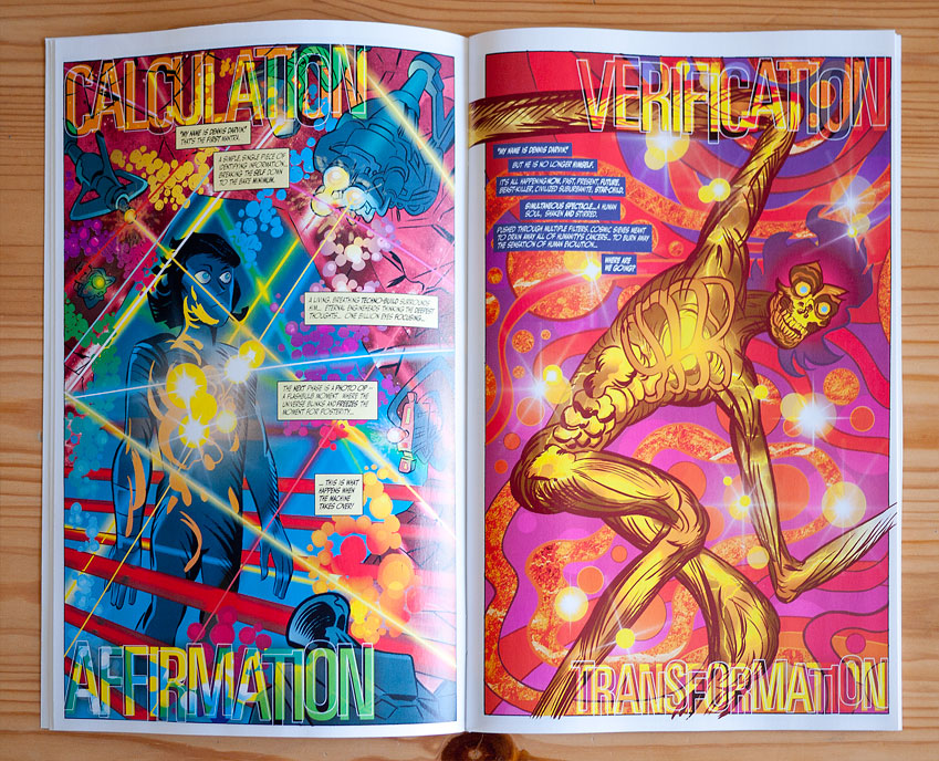


Within the comic book itself I created a collage of panels from the previous issue to introduce the story (see second image above). As the story progressed I incorporated more "classic" comic book lettering techniques, for example on the 12 page spread below, (conceived by writer Joe Casey, drawn by artist Tom Scioli, and colored by Simpson), I used arrow-shaped text boxes which move along the length of the spread and eventually flow with the lines of the art. Following that (to the right of the spread) is an example of the lettering used to indicate the evolution of the story as the chapters transition and the character's observations change. (Below you can see the spread and transition as it looked in the comic book, and below that the full length design as it is uncut. Click to enlarge.)