2024
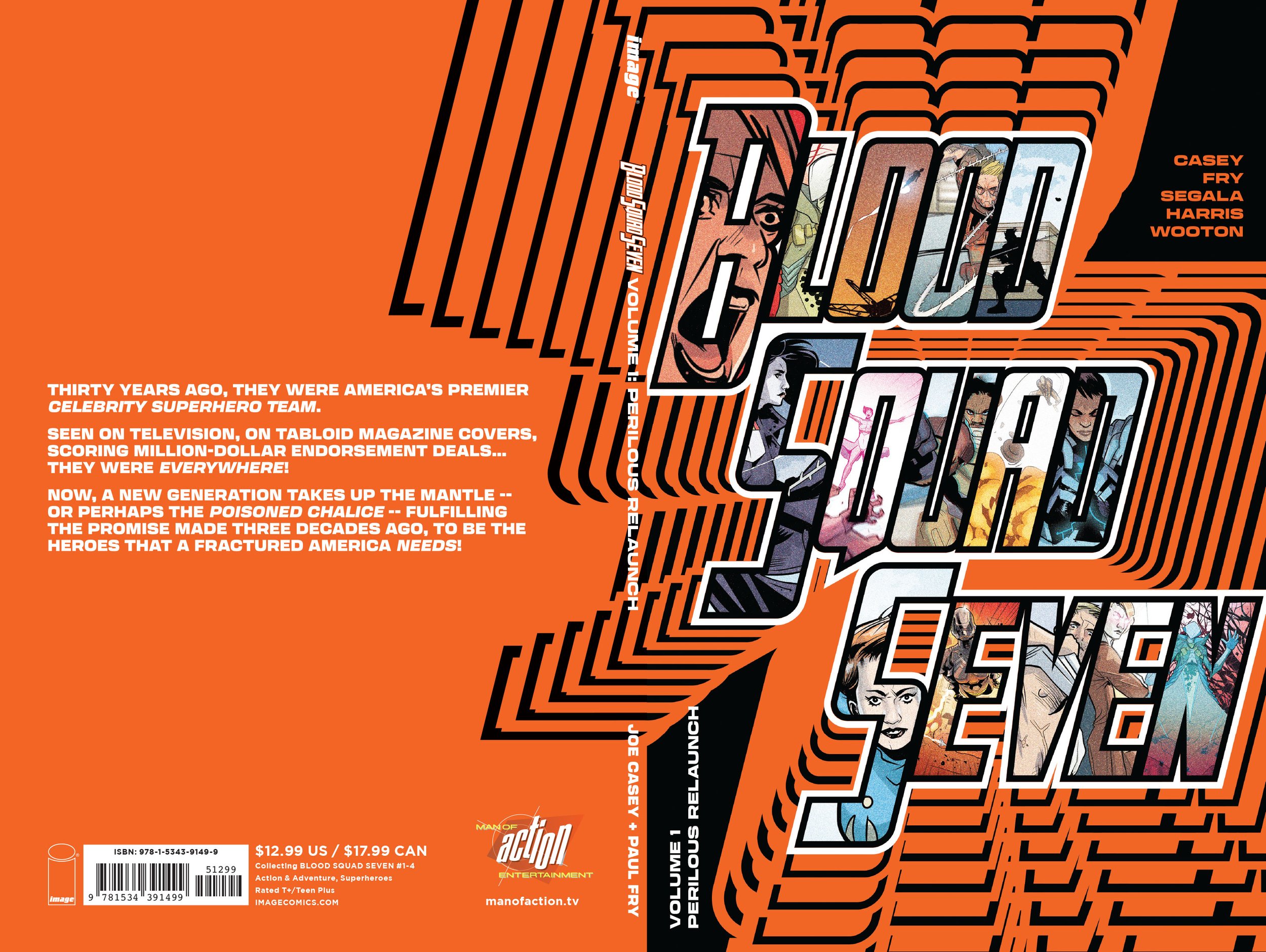
Logo, cover, and interstitial page designs for the first compilation of the ongoing comic book "Blood Squad Seven" (published by Image Comics, written by Joe Casey with art by Paul Fry).
2019
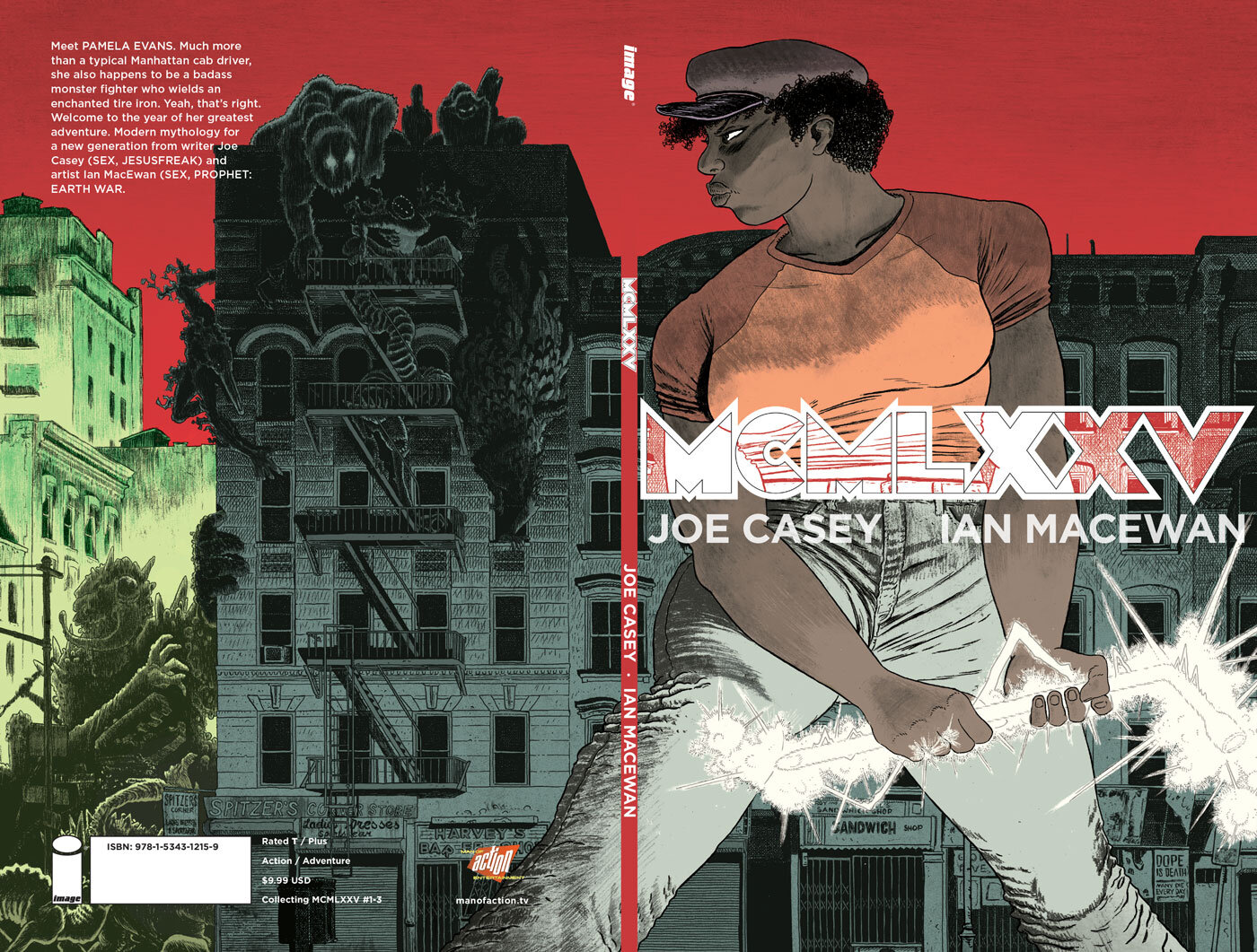
Designing a highly visible logo for this book (by Joe Casey and Ian MacEwan) was essential since the title is a bit tricky to remember! At the same time the character needed to dominate as the cover is the first introduction to her, and she’s a hell of a hero. Centering the logo and allowing it to fill the space made it dominate, and filing it with the line art helped the artwork to retain prominence. Crisp, clean, uncompromising letterforms make this a logo which speaks to the hard edges of the story and the hero depicted.
2022
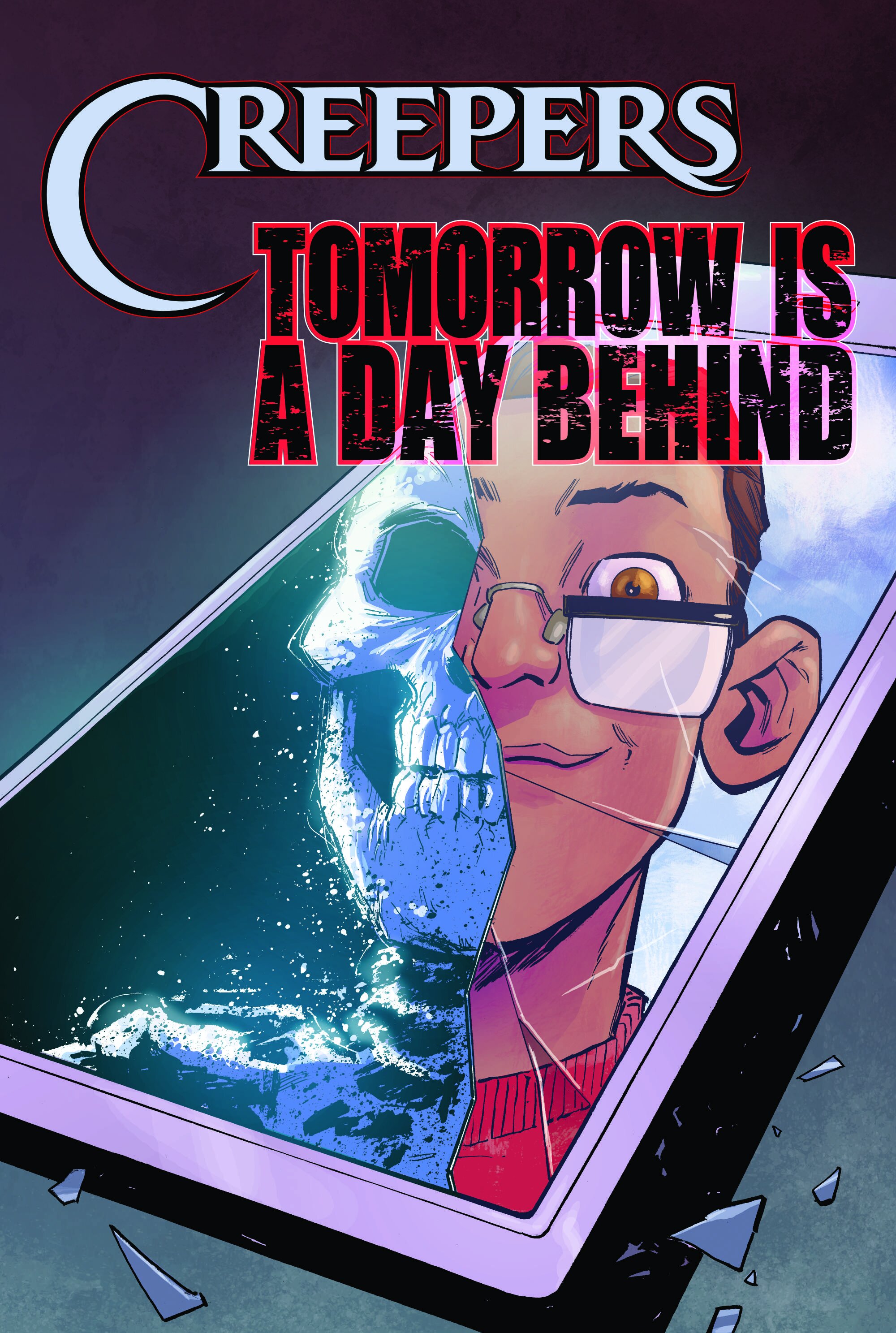
An atmospheric logo to evoke the YA horror story contained within, designed to be as communicative of the promised chills and thrills with or without accompanying cover art.
2019
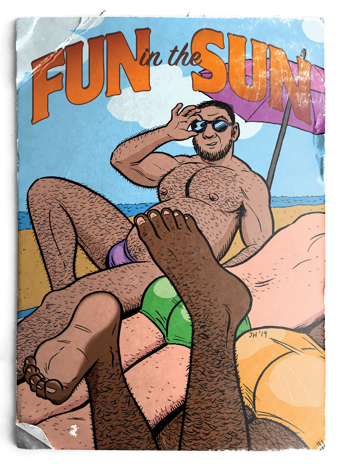
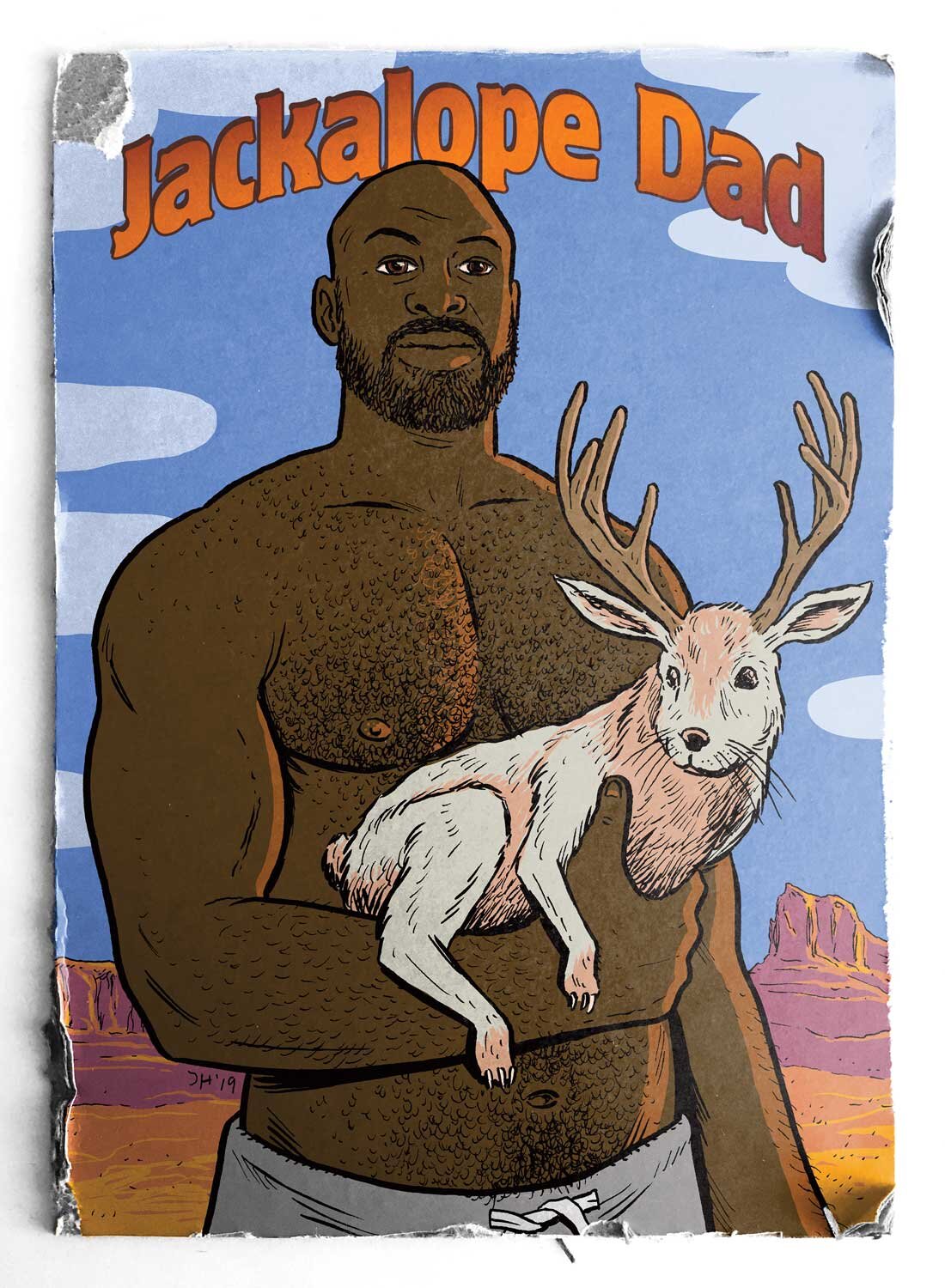
Graphic design of series of greeting cards created from a collection of drawings by established artist ;Justin Hall. Calling his series “Dadville”, Hall’s brief called for a unifying concept, something stylistically to convey the idea of saucy cards sent from a vacation. By adding a weathered, aged look and typography that gave a nod to the disposable seaside postcards of the last century these became one collection. The cards are published by and available from Silver Sprocket.

2019
A cover for Kim Krizan’s book about the archives of Anais Nin, designed using this little snapshot of her found in the very same archives. Using bold, warm colors the intimacy of the photo is emphasized and invites the reader in. Keeping the title large makes it legible even when displayed online as a thumbnail, while the delicacy of the line weight means the type doesn’t dominate the imagery but allows it to shine.

2019
Logo, cover art and layout design, typography, photography, and interstitial page designs for the sixth compilation of the ongoing comic book "Sex" (published by Image Comics, written by Joe Casey with art by Piotr Kowalski).

2017
Logo, cover art and layout design, typography, photography, and interstitial page designs for the fifth compilation of the ongoing comic book "Sex" (published by Image Comics, written by Joe Casey with art by Piotr Kowalski).
2016
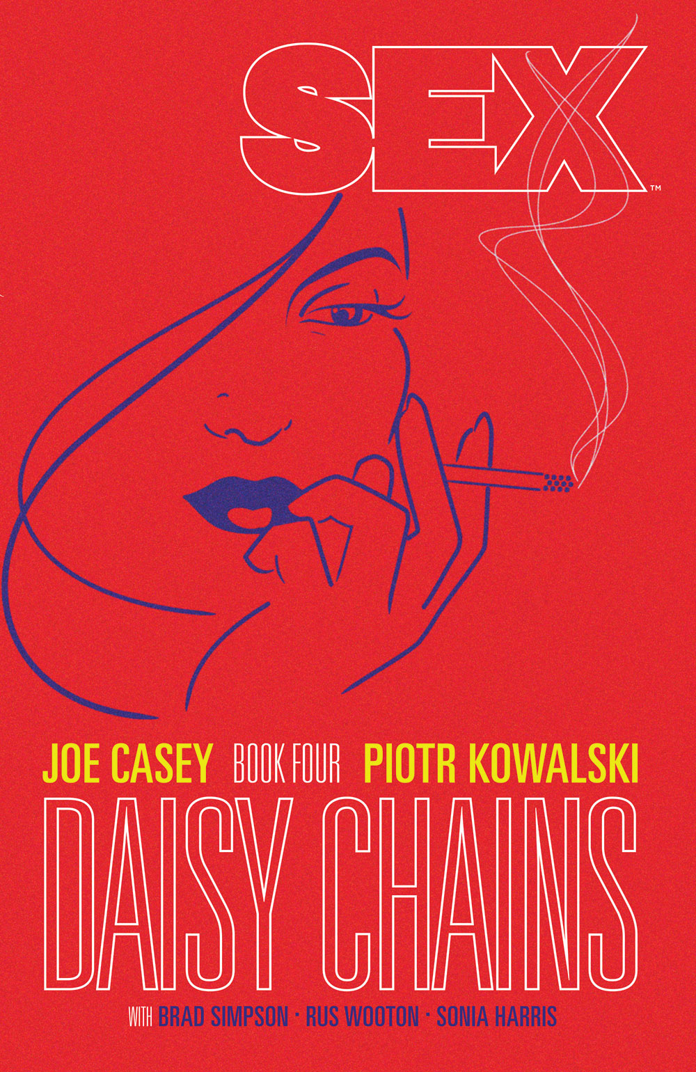
Logo, cover art and layout design, typography, photography, and interstitial page designs for the fourth compilation of the ongoing comic book "Sex" (published by Image Comics, written by Joe Casey with art by Piotr Kowalski).

2015
Logo, cover art and layout design, typography, photography, and interstitial page designs for the third compilation of the ongoing comic book "Sex" (published by Image Comics, written by Joe Casey with art by Piotr Kowalski).
2014
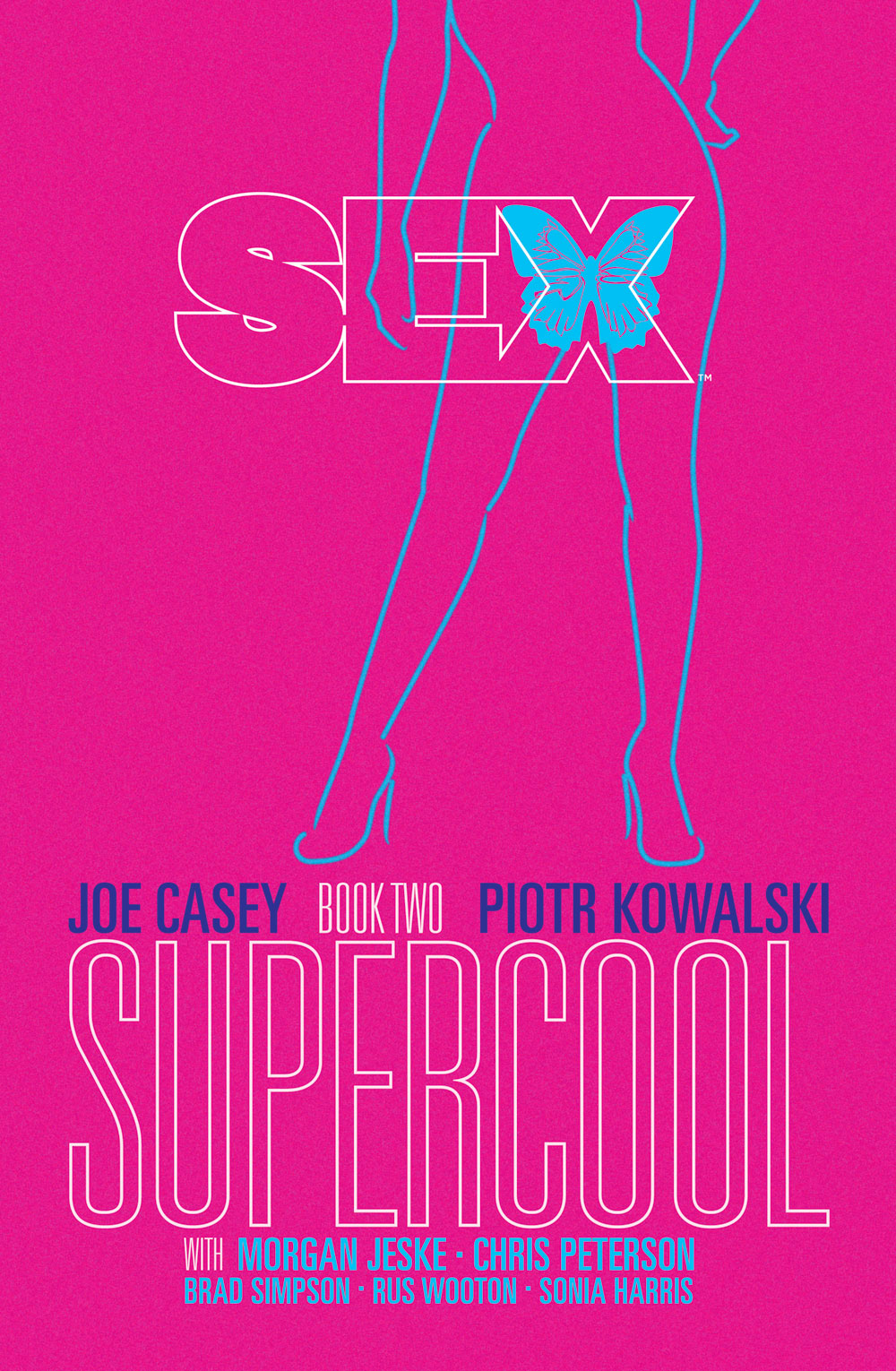
Logo, cover art and layout design, typography, photography, and interstitial page designs for the second compilation of the ongoing comic book "Sex" (published by Image Comics, written by Joe Casey with art by Piotr Kowalski).

2013
Logo, cover art and layout design, typography, photography, and interstitial page designs for this compilation of the first eight issues of the ongoing comic book "Sex" (published by Image Comics, written by Joe Casey with art by Piotr Kowalski).
2018
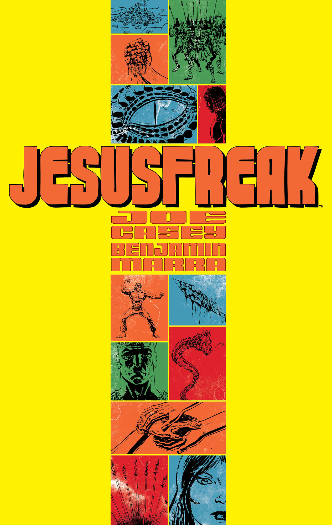
This genre book (by Joe Casey and Benjamin Marra, published by Image Comics) needed a highly stylized cover treatment, influenced by the splashy posters of ‘70’s exploitation movies and kung-fu comic books. Taking the crucifix as a template, the inset artwork (by Benjamin Marra) has a bold color palette and a weathered treatment to offset it from the stark yellow background. Designed to aggressively introduce the tone of the book to new readers, it practically yells from the shelf.
2018
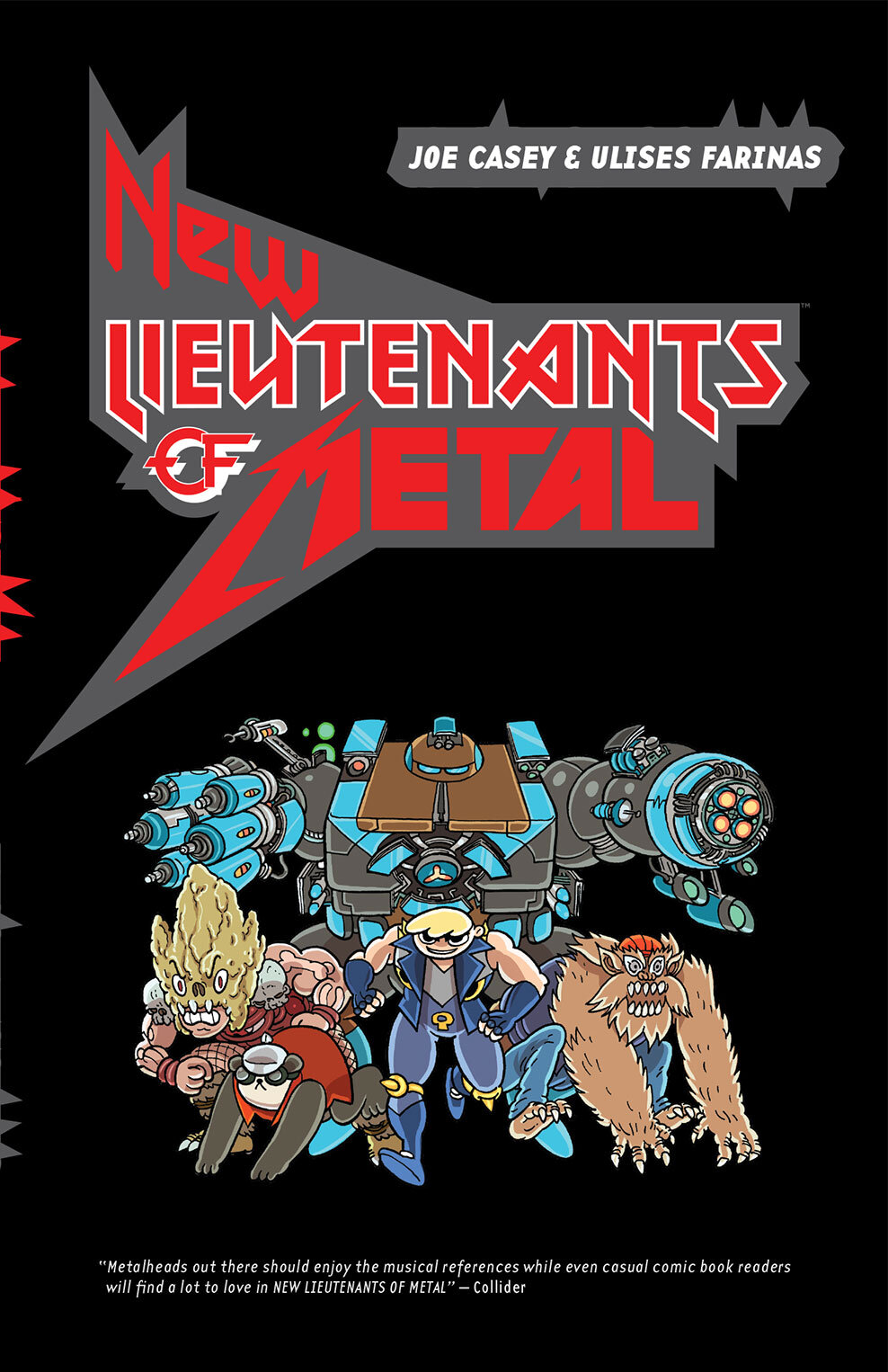
Logo and book cover (with art by Ulisses Farinas and color by Melody Often) published by Image Comics). Creating a logo that incorporated the styel of well known metal bands took time, but it was worth it! This punchy logo includes echoes of the Motley Crue logo, the Van Halen logo, the Metallica logo and even Ozzy Osborne’s logo. Then taking interior art from a splash page to serve as an introduction to the characters meant no special art was required for the cover. A fun quick cover to complement a logo designed to dominate.

2015
Book cover (with art by Darick Robertson), published by Black Mask Studio, by Adam Egypt and Darick Roberston). A science fiction comic book, this compilation was designed specifically to introduce a new readership to the series. Contained in one book, the cover design utilizes interior art originally created for a double page spread. By re-using this as a monochrome image the intense detail of the futuristic city is revealed. Simultaneously, the two stars of the book (the protagonist and his weapon) are highlighted with basic icons created to float in the negative space and contradict the insanity of the detailed art.
2015
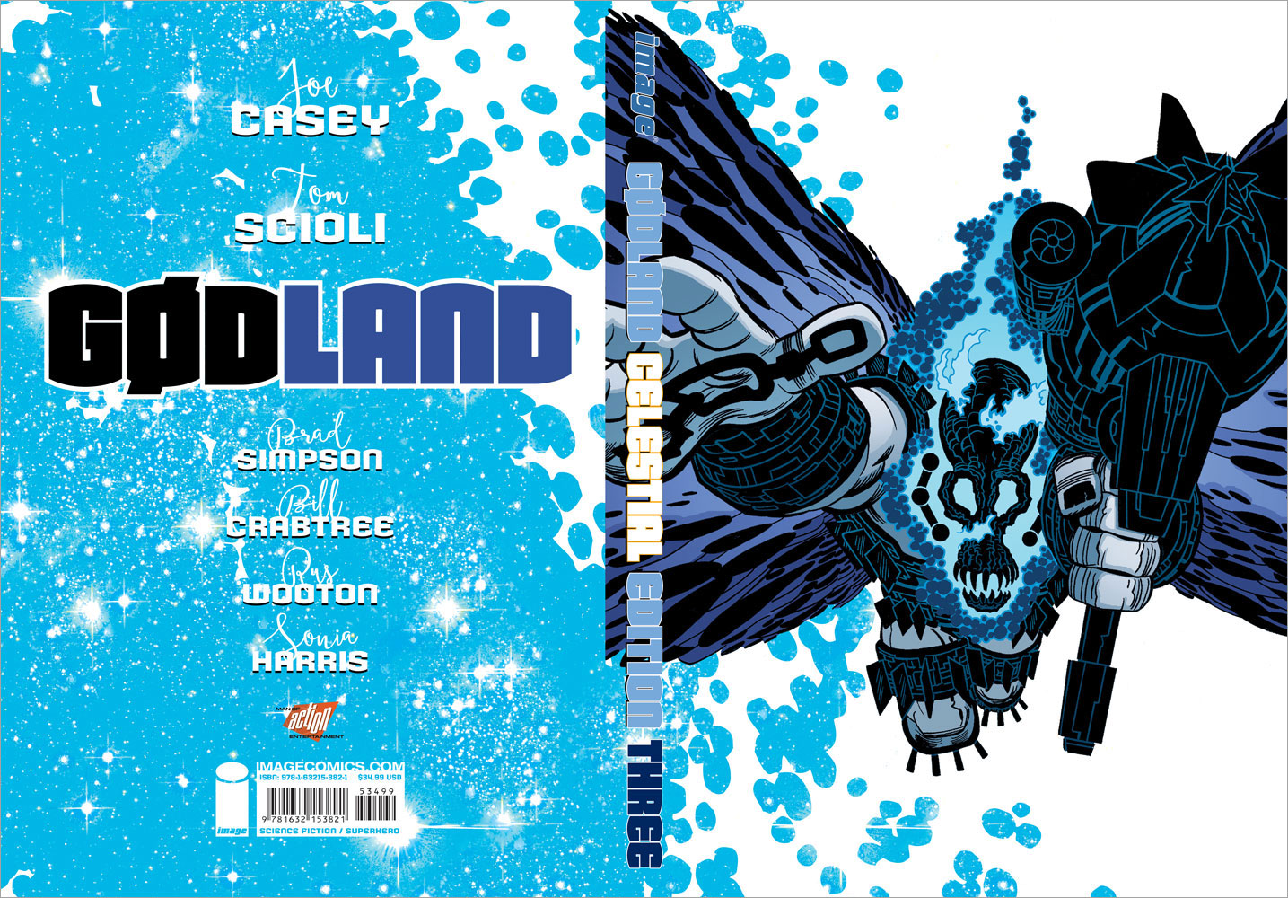
Logo, cover and layout design, typography, photography, and interstitial page designs for the third and final compilation of the comic book "Gødland" (published by Image Comics, by Joe Casey and Tom Scioli). Designing the third volume in a series of premium compilations meant creating a design that not only worked to present the story clearly, but also a design that would work with the existing book designs. Using the first two volumes to create a basic style guide, I was able to organize information and combine a surprising array of new visual elements to create an elegant, cohesive package for collectors of the series.
2015
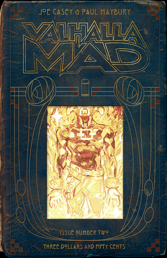
Logo and book cover (with inset art by Paul Maybury, published by Image Comics, by Joe Casey and Paul Maybury). The cover emulates an ornate, antique, leather-bound tome, while the logo is intended to evoke the brash, humorous nature of the story inside.
2015
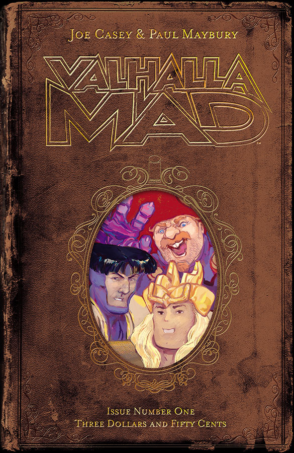
Logo and book cover (with inset art by Paul Maybury, published by Image Comics, by Joe Casey and Paul Maybury). The cover emulates an ornate, antique, leather-bound tome, while the logo is intended to evoke the brash, humorous nature of the story inside.
2014
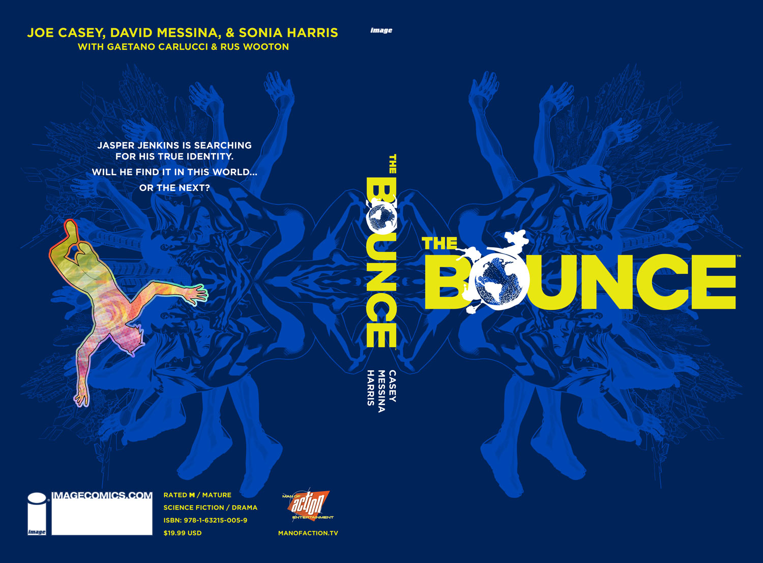
Logo, cover collage and layout design for the compilation of the 12-issue comic book "The Bounce" (published by Image Comics, by Joe Casey, David Messina, and Sonia Harris). Designed to evoke the psychedelic, science fiction angle of the plot, and attract the attention of a new audience after the individual issues of the comic books.
2013
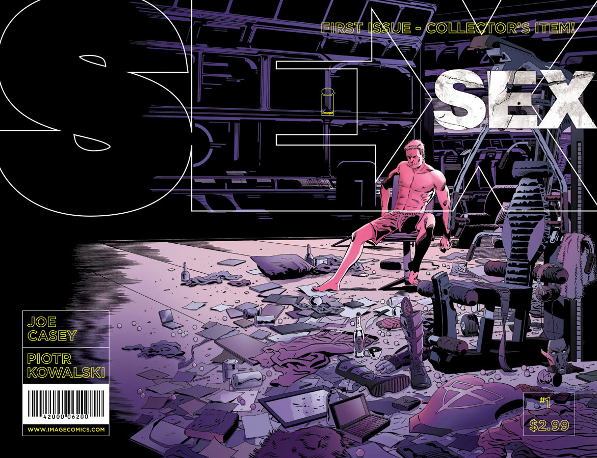
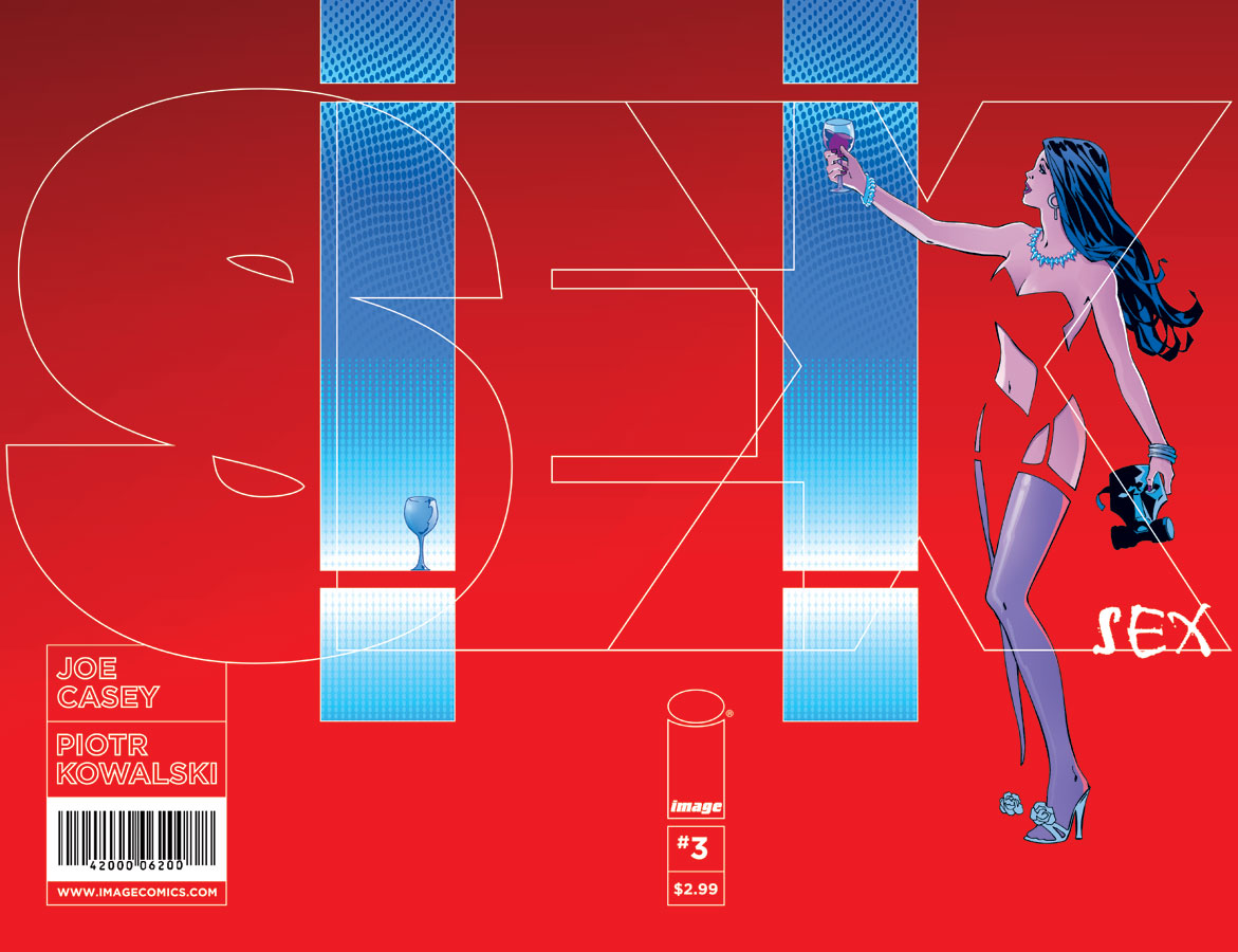
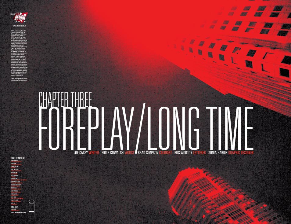
Logos, cover layout, typography, photography, and interstitial page designs for this ongoing comic book from Image Publishing, by Joe Casey and Piotr Kowalski. Designed to evoke film noir of the 1960's, this is a moody, brooding look which evolves with each issue. Colors and type change to echo and compliment the predominant covers each month, simultaneously remaining recognizable as part of a cohesive series.

2012
This is the final cover design for the new novel by Josh Flanagan. Elegant minimalism contrasts with queazy color clashes, while the patina of filth evokes the protagonist’s Astro Van. (Buy the book for Amazon Kindle, or Barnes & Noble Nook.)
2012
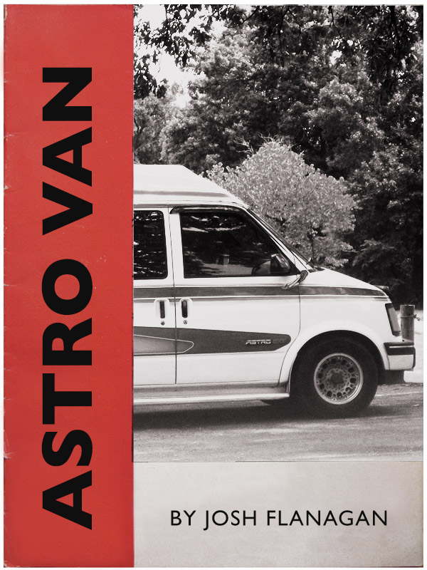
This is an alternative cover design for the new novel by Josh Flanagan. A vintage photograph of an Astro Van is used in this pastiche of an early hand book for the vehicle to create a retro feel. (Buy the book for Amazon Kindle, or Barnes & Noble Nook.)

2012
This is an alternative cover design for the new novel by Josh Flanagan. Stock photography of a highway through the desert combines with a crisp, sparse design to embody the journey of the protagonist. (Buy the book for Amazon Kindle, or Barnes & Noble Nook.)

2013
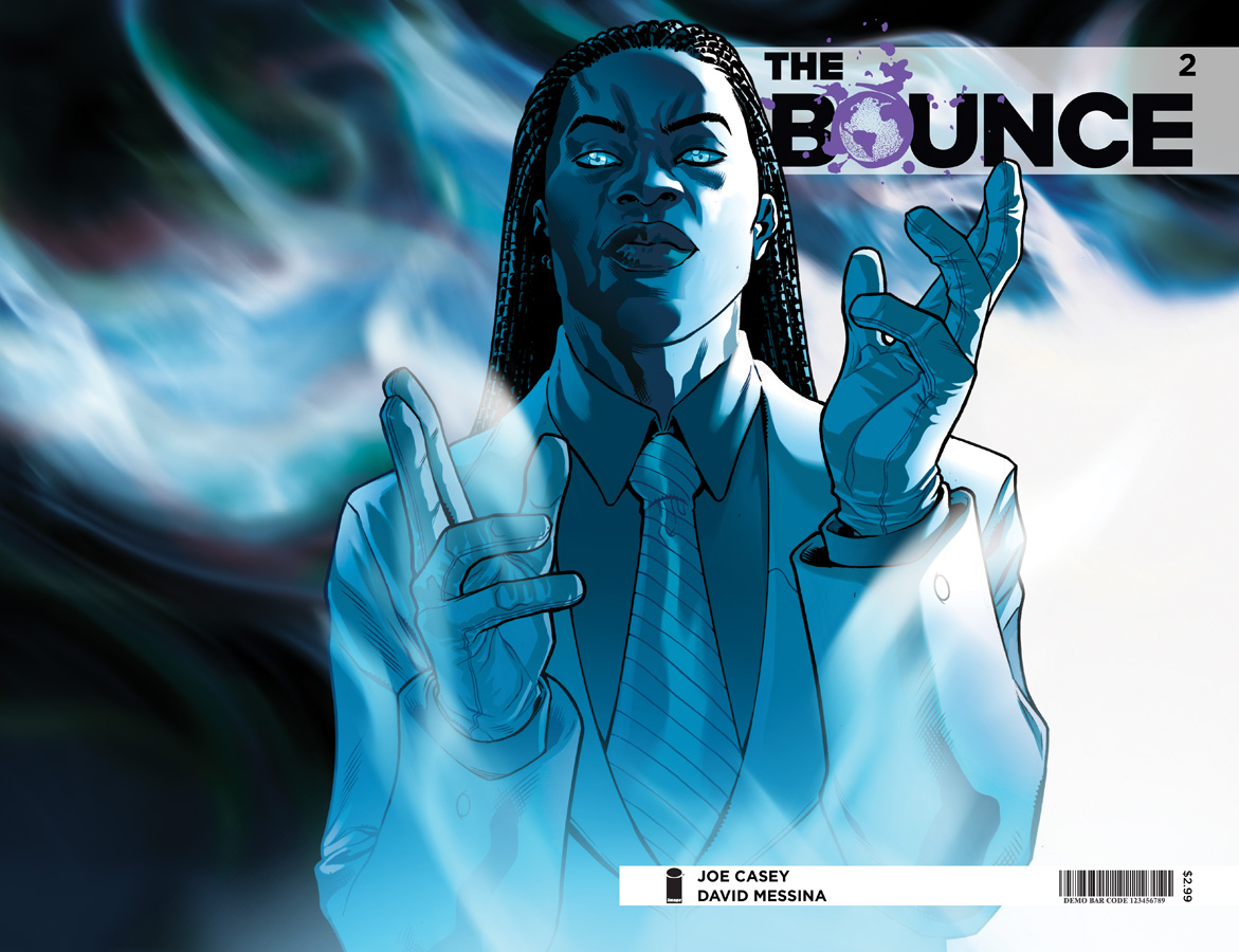
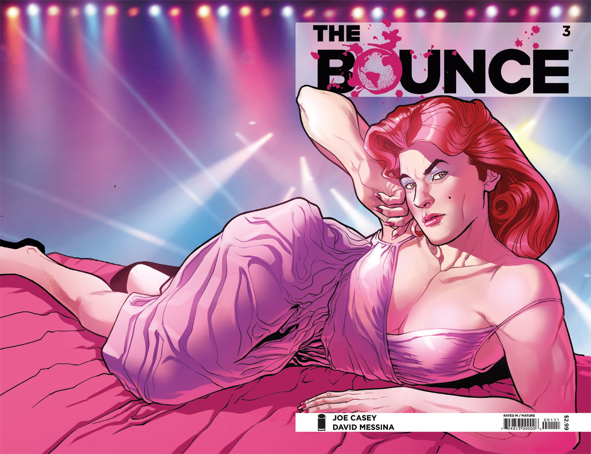
Logos, cover layout, typography, and interstitial page designs for this ongoing comic book from Image Publishing, by Joe Casey and David Messina. Each cover aims to introduce a member of the ensemble cast, using tightly cropped shots of the individuals making eye contact with us. The bold, assertive logo incorporates an increasingly chaotic element of splatter, as the ink-drawing of the world forming the "o" spreads in each issue.

2012
Logo for a new comic book from Image / Shadowline Publishing by Kurtis Wiebe and Aluisio Santos. Designed to evoke madcap cinema of the late 1950’s, the logo design and tagline completes the cover art. More about the process is written here.
2013
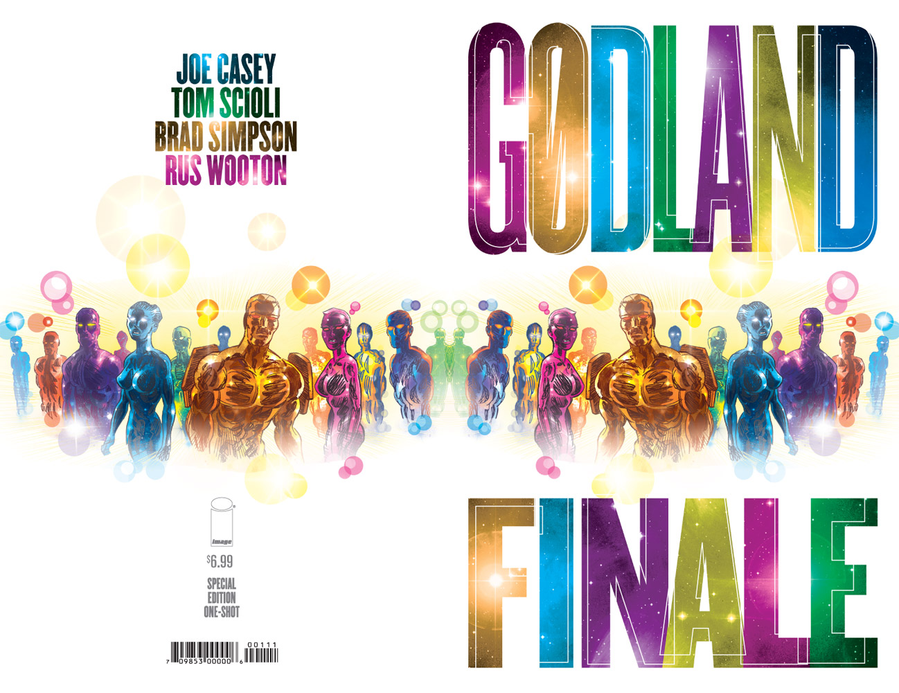
Cover and internal typography effects for the finale of the ongoing comic book "Gødland" (published by Image Comics, by Joe Casey and Tom Scioli, with coloring by Brad Simpson and story lettering by Rus Wooton).
2011
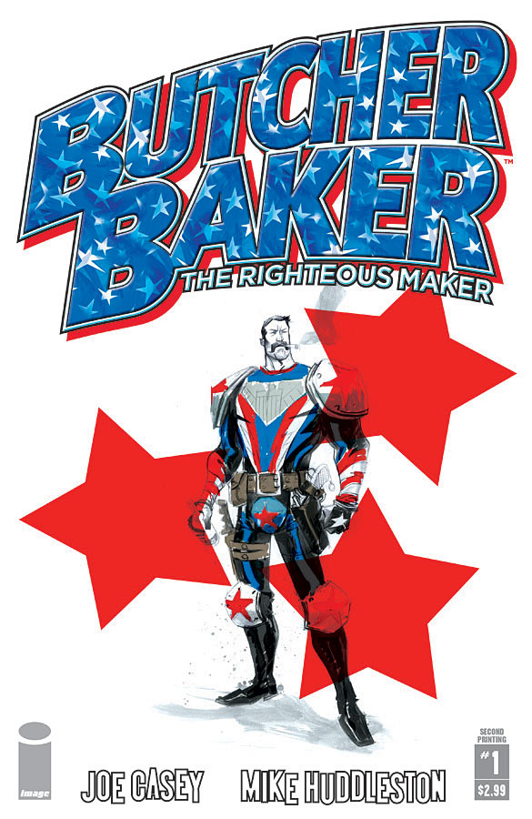
Logos, cover design, and interstitial pages for this Image Publishing comic book, by Joe Casey and Mike Huddleston. Designed to evoke classic action-hero comic books, these high-impact cover designs use a red, white, and blue theme to reinforce a patriotic hero of a bygone age.
2011
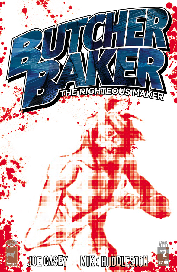
Logos, cover design, and interstitial pages for this Image Publishing comic book, by Joe Casey and Mike Huddleston. Designed to evoke classic action-hero comic books, these high-impact cover designs use a red, white, and blue theme to reinforce a patriotic hero of a bygone age.

2011
Visual interpretations of subversive greetings cards written by Jon Sung.

2011
Visual interpretations of subversive greetings cards written by Jon Sung.
2003
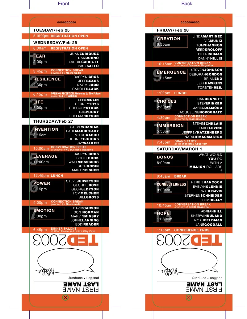
Badges designed to identify attendees and show the conference schedule (upside down, to allow attendees to read while wearing the badges.) Color coding for each type of attendee allows security to immediately identify wearers.
1999
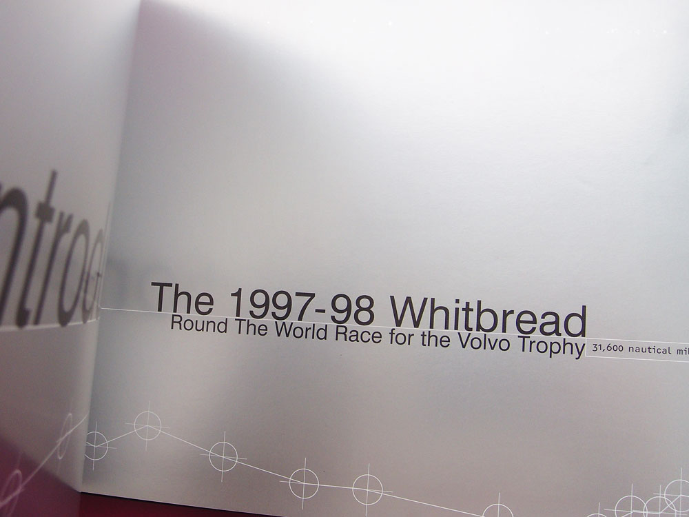
Design and production of the interstitial (silver) pages of the book of the website of the ‘97-‘98 around the world yacht race, (published by Rizzoli) documenting the Quokka website. The layout of these silver pages provides a rhythm in between the heavily photographic chapter contents.
1999
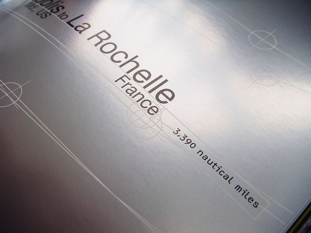
Design and production of the interstitial (silver) pages of the book of the website of the ‘97-‘98 around the world yacht race, (published by Rizzoli) documenting the Quokka website. The layout of these silver pages provides a rhythm in between the heavily photographic chapter contents.
1999
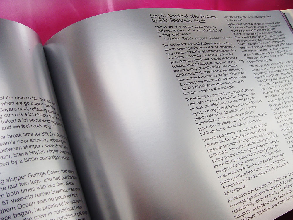
Design and production of the interstitial (silver) pages of the book of the website of the ‘97-‘98 around the world yacht race, (published by Rizzoli) documenting the Quokka website. The layout of these silver pages provides a rhythm in between the heavily photographic chapter contents.
2001
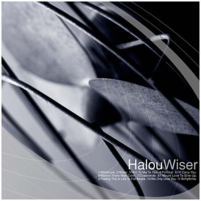
CD digipak design, layout and production on this clean, minimalist design using basic stock photography of a dirty fan with 50% hairline silver overprint.

1999
CD cover art, packaging design, and interior artwork.
1997
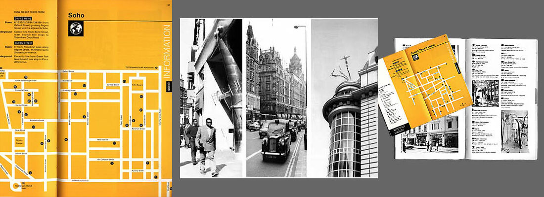
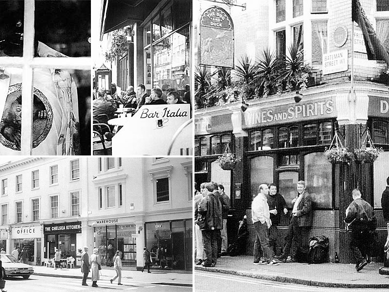
Photography, reviews, layout, maps, and information design (with Greg Mason Design Consultancy in London) for this pocket guide to the major shopping areas of central London. Created exclusively for Vidal Sassoon students to assist in their training.
1997
Photography, reviews, layout, maps, and information design (with Greg Mason Design Consultancy in London) for this pocket guide to the major shopping areas of central London. Created exclusively for Vidal Sassoon students to assist in their training.

2003
Interior design book featuring my old design studio in a series of spreads and on the cover.

2003
Interior design book featuring my old design studio.

2003
Interior design book featuring my old design studio.

2003
Interior design book featuring my old design studio.

2003
Interior design book featuring my old design studio.

2003
Interior design book featuring my old design studio.

2003
Interior design book featuring my old design studio.


2024
Logo, cover, and interstitial page designs for the first compilation of the ongoing comic book "Blood Squad Seven" (published by Image Comics, written by Joe Casey with art by Paul Fry).
2019
Designing a highly visible logo for this book (by Joe Casey and Ian MacEwan) was essential since the title is a bit tricky to remember! At the same time the character needed to dominate as the cover is the first introduction to her, and she’s a hell of a hero. Centering the logo and allowing it to fill the space made it dominate, and filing it with the line art helped the artwork to retain prominence. Crisp, clean, uncompromising letterforms make this a logo which speaks to the hard edges of the story and the hero depicted.
2022
An atmospheric logo to evoke the YA horror story contained within, designed to be as communicative of the promised chills and thrills with or without accompanying cover art.
2019
Graphic design of series of greeting cards created from a collection of drawings by established artist ;Justin Hall. Calling his series “Dadville”, Hall’s brief called for a unifying concept, something stylistically to convey the idea of saucy cards sent from a vacation. By adding a weathered, aged look and typography that gave a nod to the disposable seaside postcards of the last century these became one collection. The cards are published by and available from Silver Sprocket.
2019
A cover for Kim Krizan’s book about the archives of Anais Nin, designed using this little snapshot of her found in the very same archives. Using bold, warm colors the intimacy of the photo is emphasized and invites the reader in. Keeping the title large makes it legible even when displayed online as a thumbnail, while the delicacy of the line weight means the type doesn’t dominate the imagery but allows it to shine.
2019
Logo, cover art and layout design, typography, photography, and interstitial page designs for the sixth compilation of the ongoing comic book "Sex" (published by Image Comics, written by Joe Casey with art by Piotr Kowalski).
2017
Logo, cover art and layout design, typography, photography, and interstitial page designs for the fifth compilation of the ongoing comic book "Sex" (published by Image Comics, written by Joe Casey with art by Piotr Kowalski).
2016
Logo, cover art and layout design, typography, photography, and interstitial page designs for the fourth compilation of the ongoing comic book "Sex" (published by Image Comics, written by Joe Casey with art by Piotr Kowalski).
2015
Logo, cover art and layout design, typography, photography, and interstitial page designs for the third compilation of the ongoing comic book "Sex" (published by Image Comics, written by Joe Casey with art by Piotr Kowalski).
2014
Logo, cover art and layout design, typography, photography, and interstitial page designs for the second compilation of the ongoing comic book "Sex" (published by Image Comics, written by Joe Casey with art by Piotr Kowalski).
2013
Logo, cover art and layout design, typography, photography, and interstitial page designs for this compilation of the first eight issues of the ongoing comic book "Sex" (published by Image Comics, written by Joe Casey with art by Piotr Kowalski).
2018
This genre book (by Joe Casey and Benjamin Marra, published by Image Comics) needed a highly stylized cover treatment, influenced by the splashy posters of ‘70’s exploitation movies and kung-fu comic books. Taking the crucifix as a template, the inset artwork (by Benjamin Marra) has a bold color palette and a weathered treatment to offset it from the stark yellow background. Designed to aggressively introduce the tone of the book to new readers, it practically yells from the shelf.
2018
Logo and book cover (with art by Ulisses Farinas and color by Melody Often) published by Image Comics). Creating a logo that incorporated the styel of well known metal bands took time, but it was worth it! This punchy logo includes echoes of the Motley Crue logo, the Van Halen logo, the Metallica logo and even Ozzy Osborne’s logo. Then taking interior art from a splash page to serve as an introduction to the characters meant no special art was required for the cover. A fun quick cover to complement a logo designed to dominate.
2015
Book cover (with art by Darick Robertson), published by Black Mask Studio, by Adam Egypt and Darick Roberston). A science fiction comic book, this compilation was designed specifically to introduce a new readership to the series. Contained in one book, the cover design utilizes interior art originally created for a double page spread. By re-using this as a monochrome image the intense detail of the futuristic city is revealed. Simultaneously, the two stars of the book (the protagonist and his weapon) are highlighted with basic icons created to float in the negative space and contradict the insanity of the detailed art.
2015
Logo, cover and layout design, typography, photography, and interstitial page designs for the third and final compilation of the comic book "Gødland" (published by Image Comics, by Joe Casey and Tom Scioli). Designing the third volume in a series of premium compilations meant creating a design that not only worked to present the story clearly, but also a design that would work with the existing book designs. Using the first two volumes to create a basic style guide, I was able to organize information and combine a surprising array of new visual elements to create an elegant, cohesive package for collectors of the series.
2015
Logo and book cover (with inset art by Paul Maybury, published by Image Comics, by Joe Casey and Paul Maybury). The cover emulates an ornate, antique, leather-bound tome, while the logo is intended to evoke the brash, humorous nature of the story inside.
2015
Logo and book cover (with inset art by Paul Maybury, published by Image Comics, by Joe Casey and Paul Maybury). The cover emulates an ornate, antique, leather-bound tome, while the logo is intended to evoke the brash, humorous nature of the story inside.
2014
Logo, cover collage and layout design for the compilation of the 12-issue comic book "The Bounce" (published by Image Comics, by Joe Casey, David Messina, and Sonia Harris). Designed to evoke the psychedelic, science fiction angle of the plot, and attract the attention of a new audience after the individual issues of the comic books.
2013
Logos, cover layout, typography, photography, and interstitial page designs for this ongoing comic book from Image Publishing, by Joe Casey and Piotr Kowalski. Designed to evoke film noir of the 1960's, this is a moody, brooding look which evolves with each issue. Colors and type change to echo and compliment the predominant covers each month, simultaneously remaining recognizable as part of a cohesive series.
2012
This is the final cover design for the new novel by Josh Flanagan. Elegant minimalism contrasts with queazy color clashes, while the patina of filth evokes the protagonist’s Astro Van. (Buy the book for Amazon Kindle, or Barnes & Noble Nook.)
2012
This is an alternative cover design for the new novel by Josh Flanagan. A vintage photograph of an Astro Van is used in this pastiche of an early hand book for the vehicle to create a retro feel. (Buy the book for Amazon Kindle, or Barnes & Noble Nook.)
2012
This is an alternative cover design for the new novel by Josh Flanagan. Stock photography of a highway through the desert combines with a crisp, sparse design to embody the journey of the protagonist. (Buy the book for Amazon Kindle, or Barnes & Noble Nook.)
2013
Logos, cover layout, typography, and interstitial page designs for this ongoing comic book from Image Publishing, by Joe Casey and David Messina. Each cover aims to introduce a member of the ensemble cast, using tightly cropped shots of the individuals making eye contact with us. The bold, assertive logo incorporates an increasingly chaotic element of splatter, as the ink-drawing of the world forming the "o" spreads in each issue.
2012
Logo for a new comic book from Image / Shadowline Publishing by Kurtis Wiebe and Aluisio Santos. Designed to evoke madcap cinema of the late 1950’s, the logo design and tagline completes the cover art. More about the process is written here.
2013
Cover and internal typography effects for the finale of the ongoing comic book "Gødland" (published by Image Comics, by Joe Casey and Tom Scioli, with coloring by Brad Simpson and story lettering by Rus Wooton).
2011
Logos, cover design, and interstitial pages for this Image Publishing comic book, by Joe Casey and Mike Huddleston. Designed to evoke classic action-hero comic books, these high-impact cover designs use a red, white, and blue theme to reinforce a patriotic hero of a bygone age.
2011
Logos, cover design, and interstitial pages for this Image Publishing comic book, by Joe Casey and Mike Huddleston. Designed to evoke classic action-hero comic books, these high-impact cover designs use a red, white, and blue theme to reinforce a patriotic hero of a bygone age.
2011
Visual interpretations of subversive greetings cards written by Jon Sung.
2011
Visual interpretations of subversive greetings cards written by Jon Sung.
2003
Badges designed to identify attendees and show the conference schedule (upside down, to allow attendees to read while wearing the badges.) Color coding for each type of attendee allows security to immediately identify wearers.
1999
Design and production of the interstitial (silver) pages of the book of the website of the ‘97-‘98 around the world yacht race, (published by Rizzoli) documenting the Quokka website. The layout of these silver pages provides a rhythm in between the heavily photographic chapter contents.
1999
Design and production of the interstitial (silver) pages of the book of the website of the ‘97-‘98 around the world yacht race, (published by Rizzoli) documenting the Quokka website. The layout of these silver pages provides a rhythm in between the heavily photographic chapter contents.
1999
Design and production of the interstitial (silver) pages of the book of the website of the ‘97-‘98 around the world yacht race, (published by Rizzoli) documenting the Quokka website. The layout of these silver pages provides a rhythm in between the heavily photographic chapter contents.
2001
CD digipak design, layout and production on this clean, minimalist design using basic stock photography of a dirty fan with 50% hairline silver overprint.
1999
CD cover art, packaging design, and interior artwork.
1997
Photography, reviews, layout, maps, and information design (with Greg Mason Design Consultancy in London) for this pocket guide to the major shopping areas of central London. Created exclusively for Vidal Sassoon students to assist in their training.
1997
Photography, reviews, layout, maps, and information design (with Greg Mason Design Consultancy in London) for this pocket guide to the major shopping areas of central London. Created exclusively for Vidal Sassoon students to assist in their training.
2003
Interior design book featuring my old design studio in a series of spreads and on the cover.
2003
Interior design book featuring my old design studio.
2003
Interior design book featuring my old design studio.
2003
Interior design book featuring my old design studio.
2003
Interior design book featuring my old design studio.
2003
Interior design book featuring my old design studio.
2003
Interior design book featuring my old design studio.
