2013
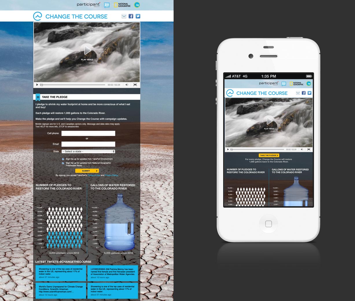
A mobile-friendly website to encourage people to sign the petition to conserve water and protect the diminishing Colorado River.
2010
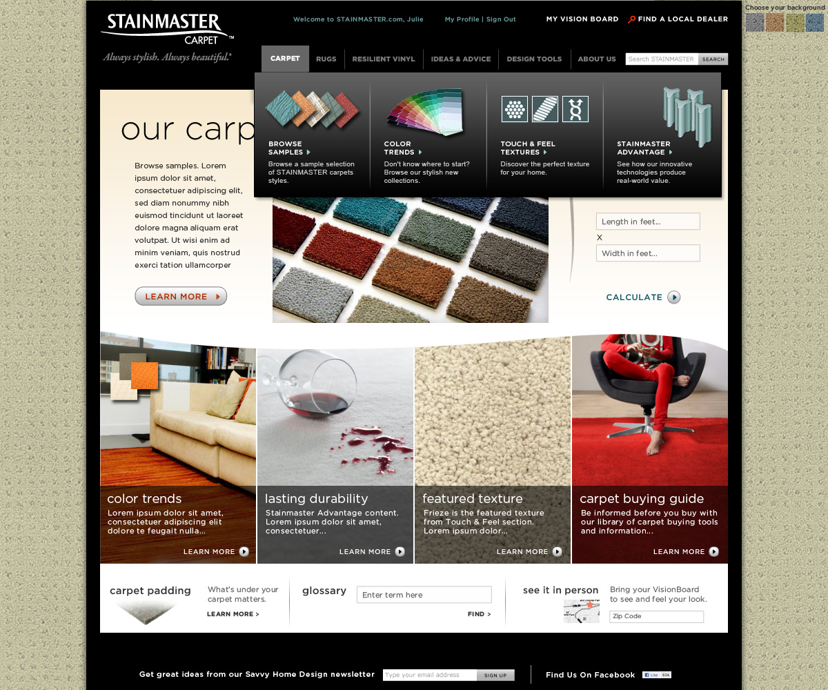
Designs for the internal sections of Stainmaster.com. The cool elegance of the design uses the swooping shape of the underline in the logo as a page dividing graphic element, reinforcing the brand. The navigation uses custom icons and photography to ease movement within the site.
2010
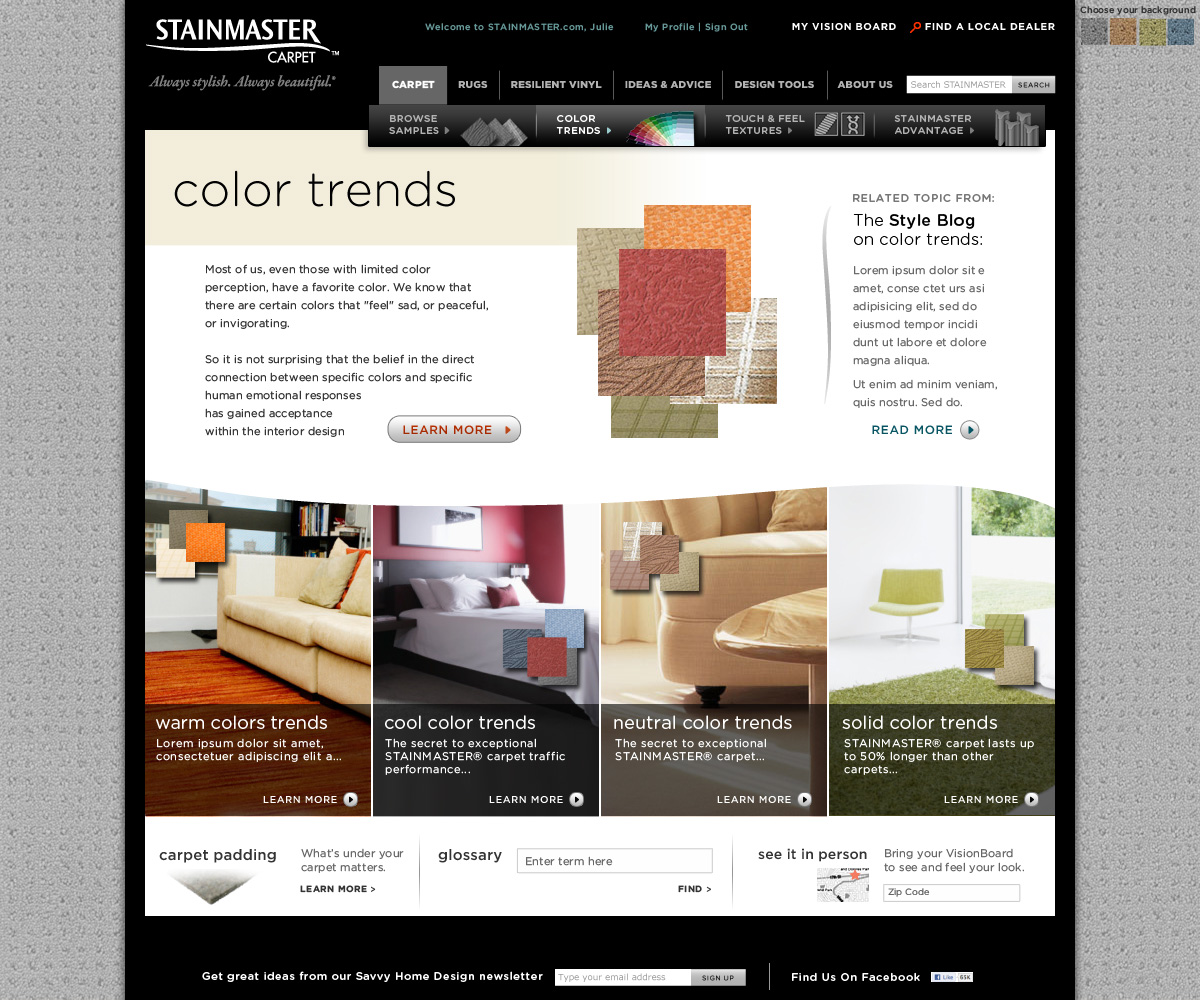
Designs for the internal sections of Stainmaster.com. The cool elegance of the design uses the swooping shape of the underline in the logo as a page dividing graphic element, reinforcing the brand. The navigation uses custom icons and photography to ease movement within the site.
2007
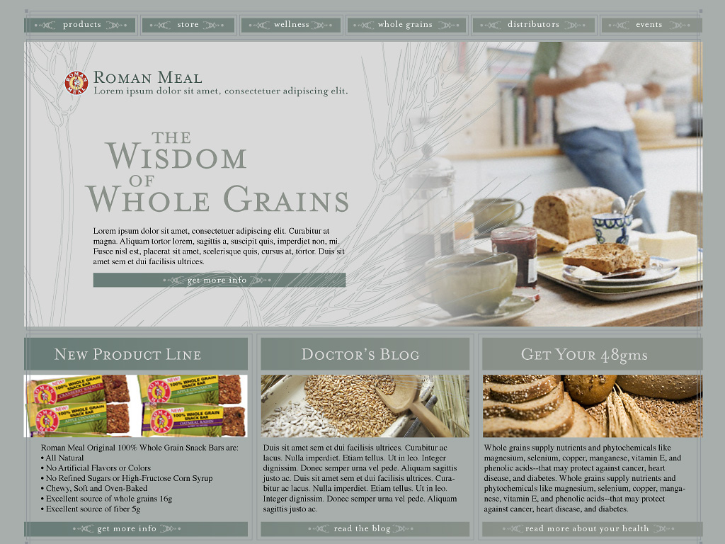
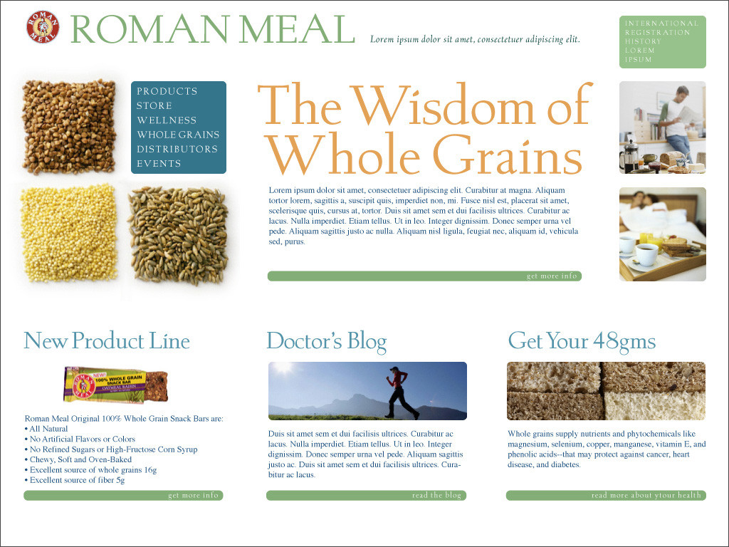
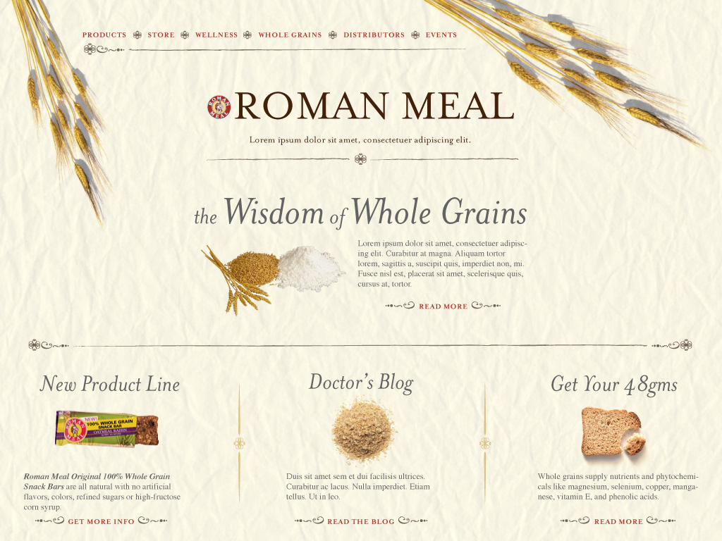
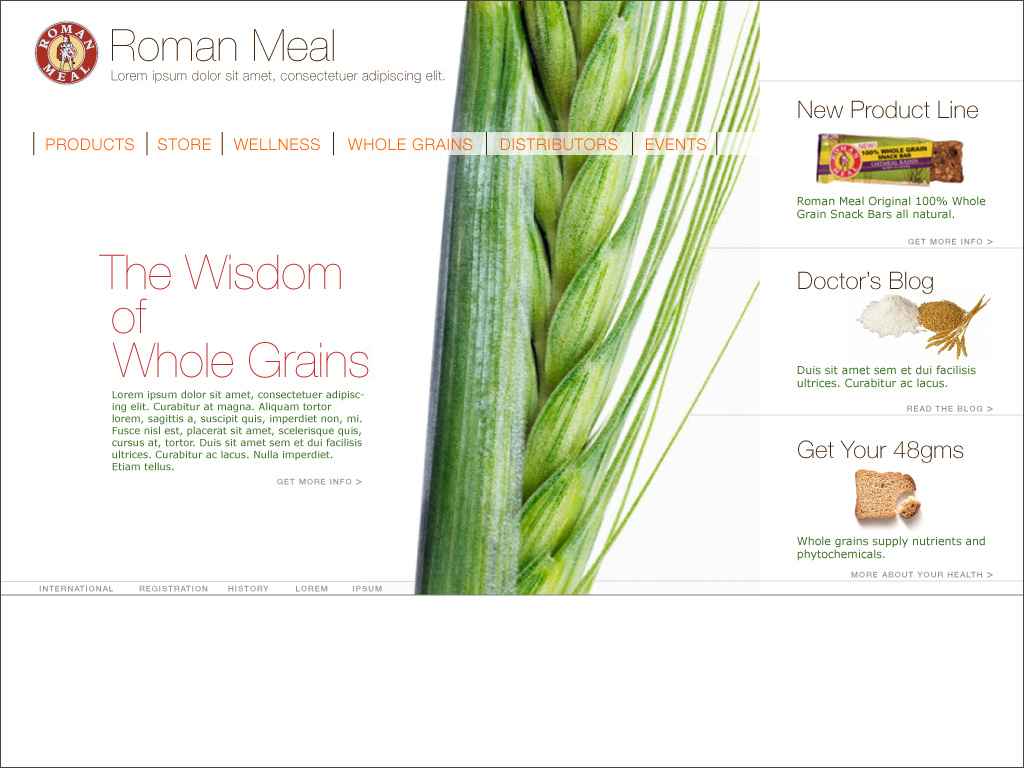
Four design options for RomanMeal.com. Created to promote the company as a proponent of positive health and the benefits of whole grains. Site design, architecture, photography direction, food styling, and production direction were all part of the final delivery.
2007
Four design options for RomanMeal.com. Created to promote the company as a proponent of positive health and the benefits of whole grains. Site design, architecture, photography direction, food styling, and production direction were all part of the final delivery.
2007
Four design options for RomanMeal.com. Created to promote the company as a proponent of positive health and the benefits of whole grains. Site design, architecture, photography direction, food styling, and production direction were all part of the final delivery.
2007
Four design options for RomanMeal.com. Created to promote the company as a proponent of positive health and the benefits of whole grains. Site design, architecture, photography direction, food styling, and production direction were all part of the final delivery.
2014
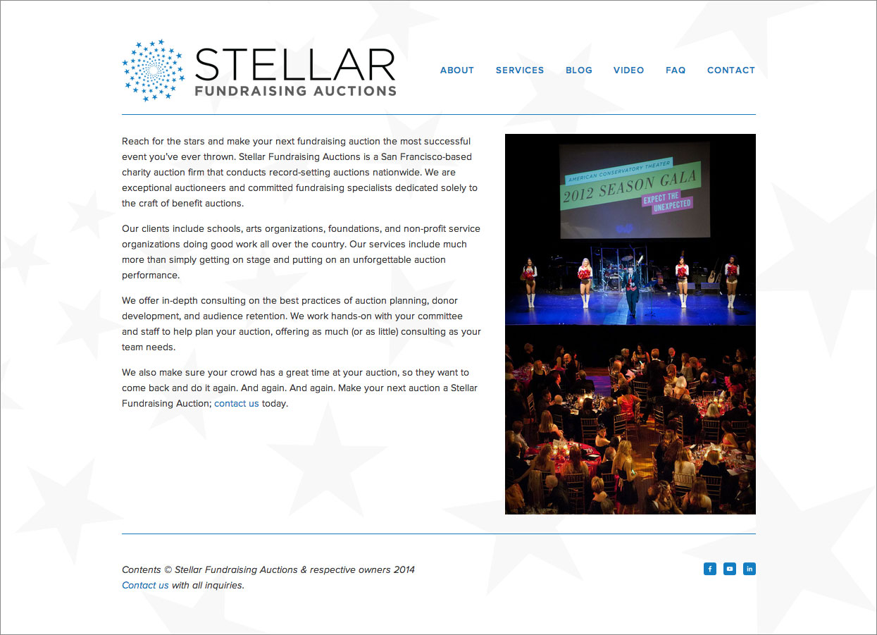
A crisp, clean, bright logo and site design for the experienced auctioneers of Stellar Fundraising Auctions. The modular design means the content and blog is simple to edit and keep up-to-date.
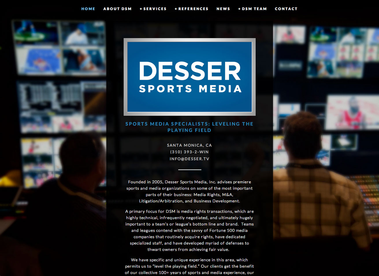
2014
A bold new site, including logo revamp and custom photography for this Santa Monica based sports media specialist. Easy to update and expand.
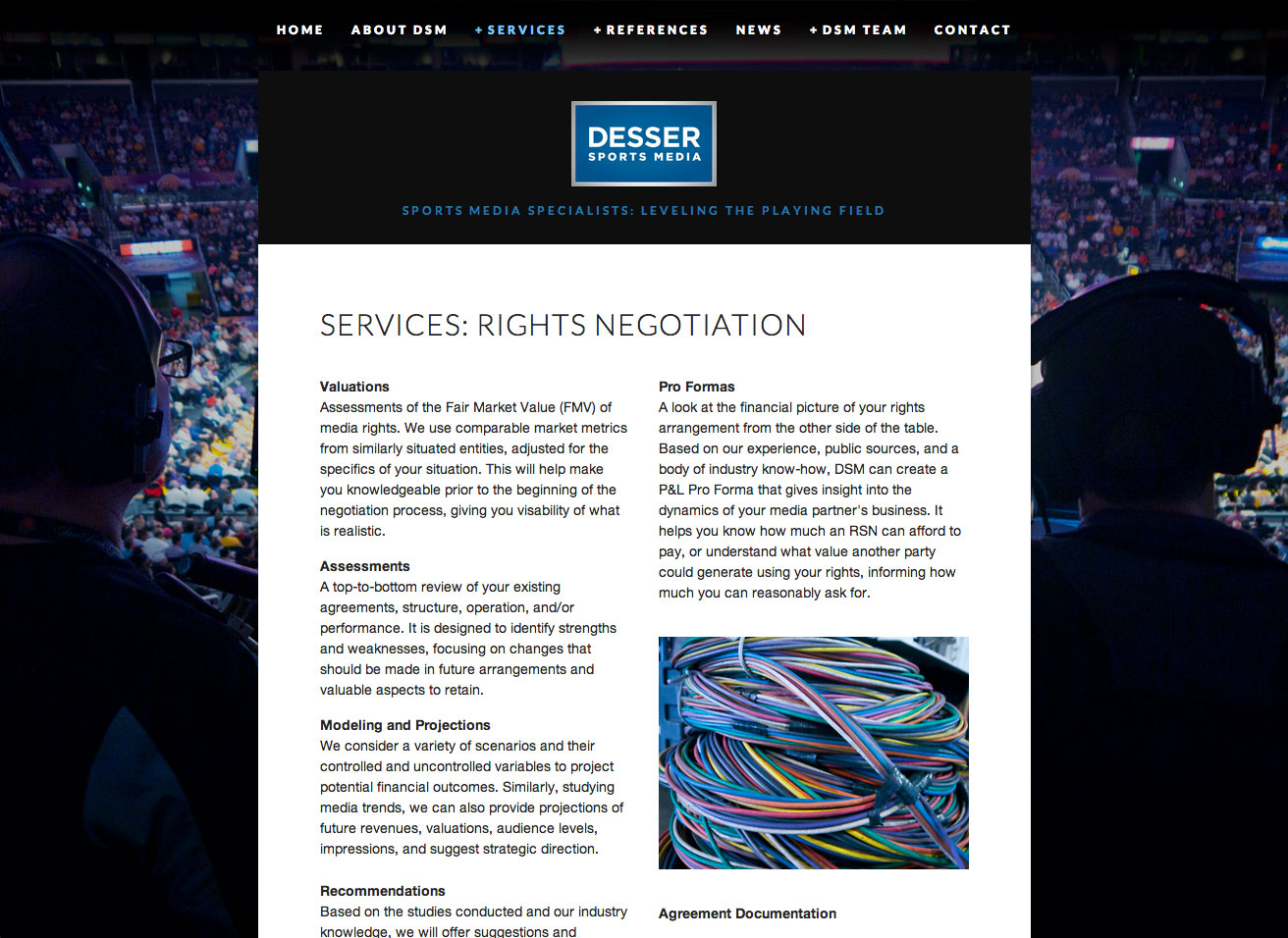
2014
A bold new site, including logo revamp and custom photography for this Santa Monica based sports media specialist. Easy to update and expand.
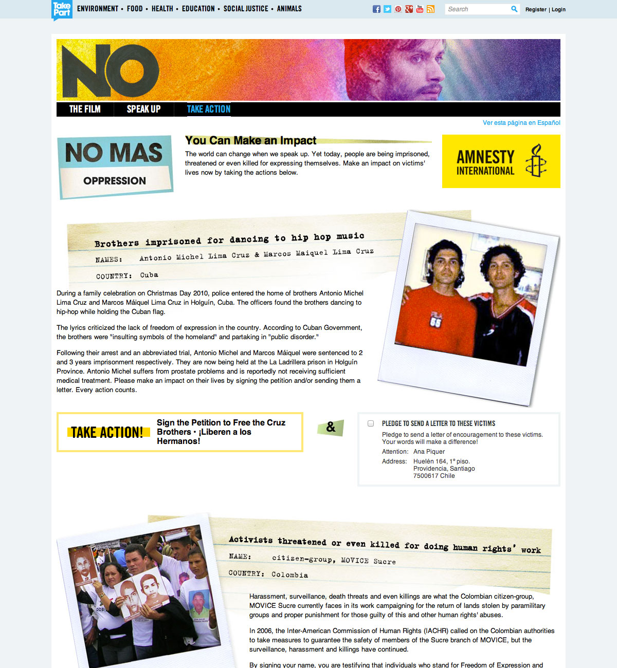
2012
Website for the film "NO", about 1988 advertising campaign around the Chilean referendum on military dictator Augusto Pinochet's presidency. Site design uses classic '80's visual elements and objects derived from the film to create an engaging atmosphere for the social action elements, as well as promoting and echoing the film itself.
View the site here.
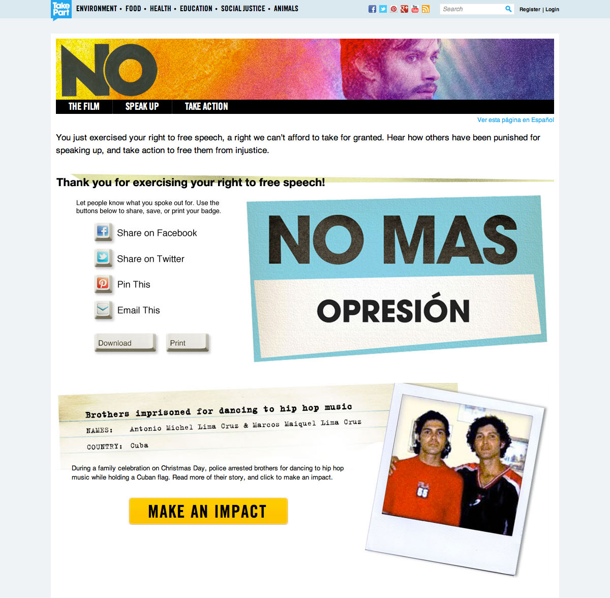
2012
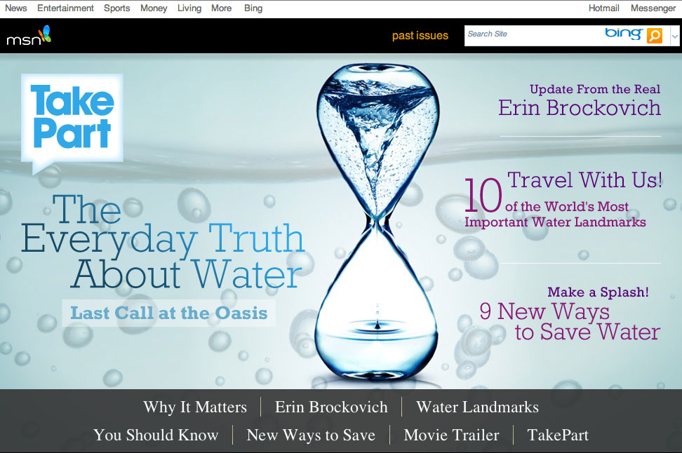
Cover, gallery, ad banner designs, and photo manipulation for this TakePart.com and MSN website. Highlighting specific issues each week with a strong, clean bright design to reinforce a positive approach to these serious messages.
2012
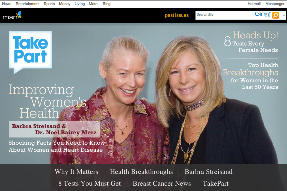
Cover, gallery, ad banner designs, and photo manipulation for this TakePart.com and MSN website. Highlighting specific issues each week with a strong, clean bright design to reinforce a positive approach to these serious messages.
2012
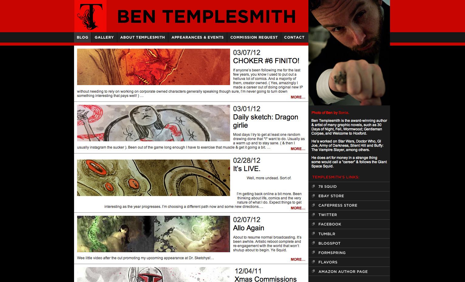
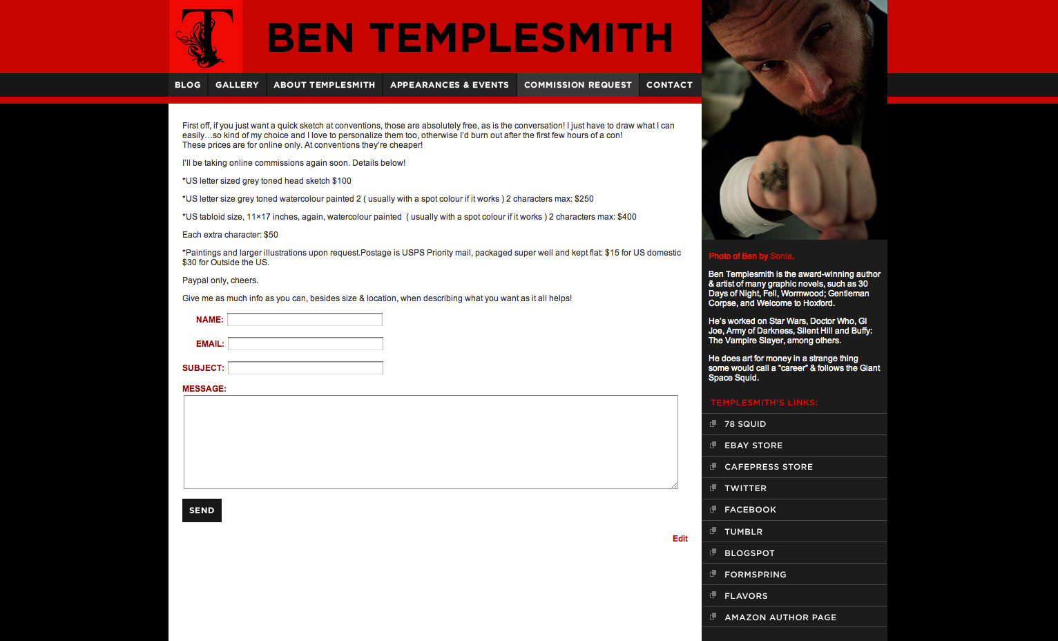
Portal / hub website to promote the work of artist, Ben Templesmith. Comprising of a gallery, blog, appearances diary, contact section, and consolidating all of his social media and store links. Updatable by the artist, the site design echoes and compliments the current style and color palette established in his existing logo.
2007
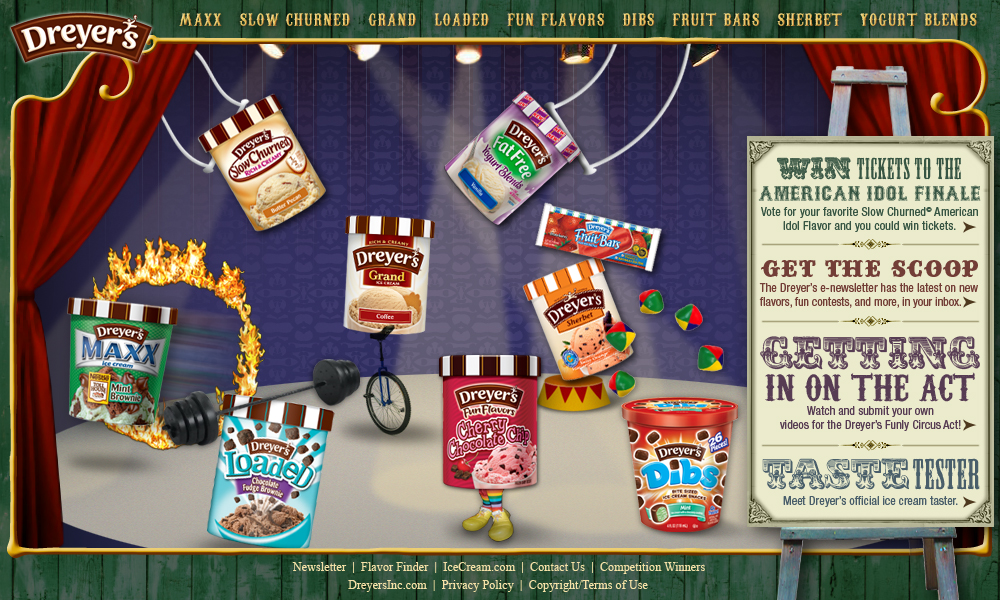
Designed and architecture of proposed Dreyer’s website. Using an animated, circus-themed design, each product family has a performer representative. The site highlights the diverse variety of Dreyer’s products, incorporating social media element to encourage interaction and participation.
2007
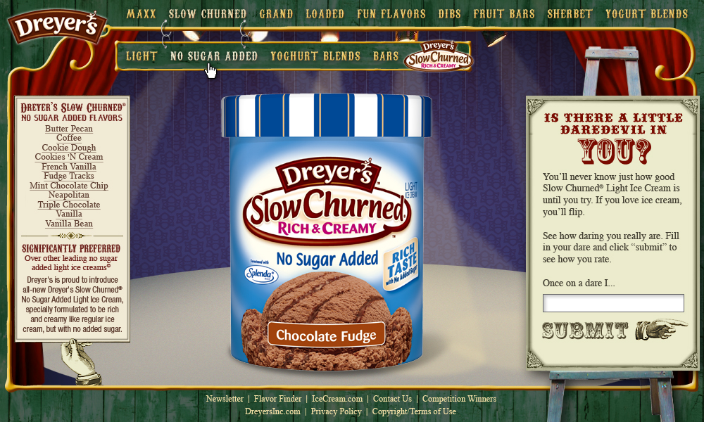
Designed and architecture of proposed Dreyer’s website. Using an animated, circus-themed design, each product family has a performer representative. The site highlights the diverse variety of Dreyer’s products, incorporating social media element to encourage interaction and participation.

2008
One of three designs for an elegant new home page for this pharmaceutical site. Created to help individuals quickly find the right information for their specific problem by color-coding each aspect of the site, and photographically giving a human face to each section of the site.

2008
One of three designs for an elegant new home page for this pharmaceutical site. Created to help individuals quickly find the right information for their specific problem by color-coding each aspect of the site, and photographically giving a human face to each section of the site.

2008
One of three designs for an elegant new home page for this pharmaceutical site. Created to help individuals quickly find the right information for their specific problem by color-coding each aspect of the site, and photographically giving a human face to each section of the site.
2007
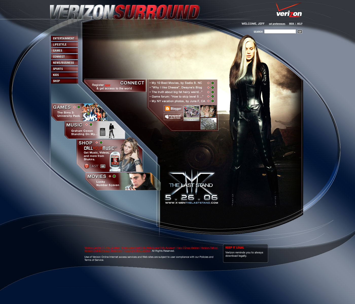
Modular home page designs for rich-media Verizon Surround home. Two different marketing sponsorship options are depicted within the same design, to illustrate the flexibility of the design.
2007
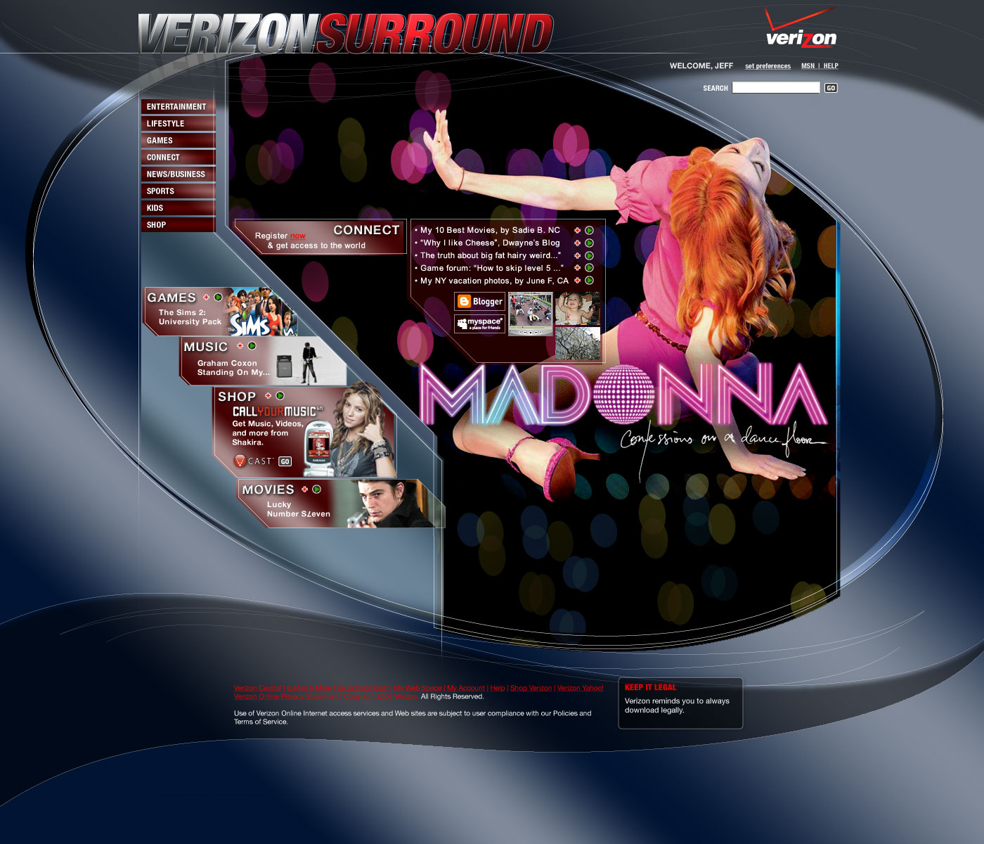
Modular home page designs for rich-media Verizon Surround home. Two different marketing sponsorship options are depicted within the same design, to illustrate the flexibility of the design.
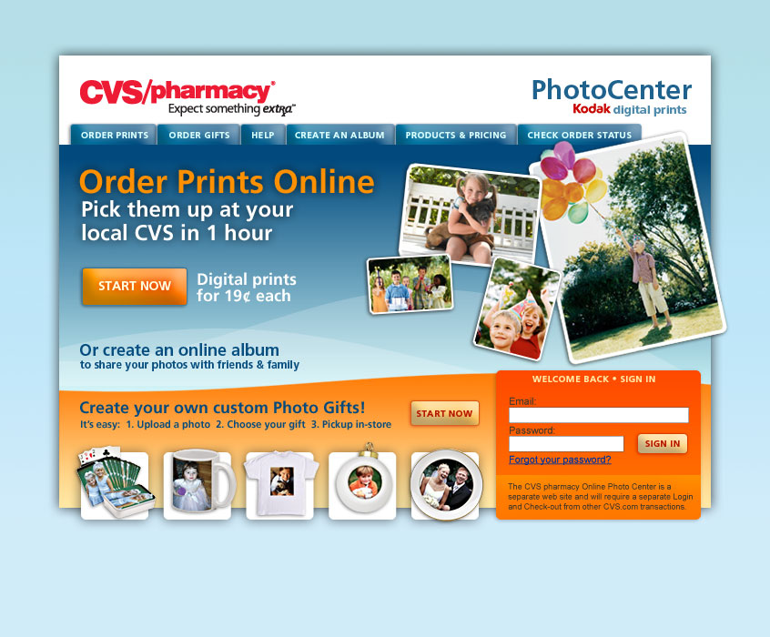
2006
Home page design targeting new user sign-ups, and generally more appealing for new visitors to the site.
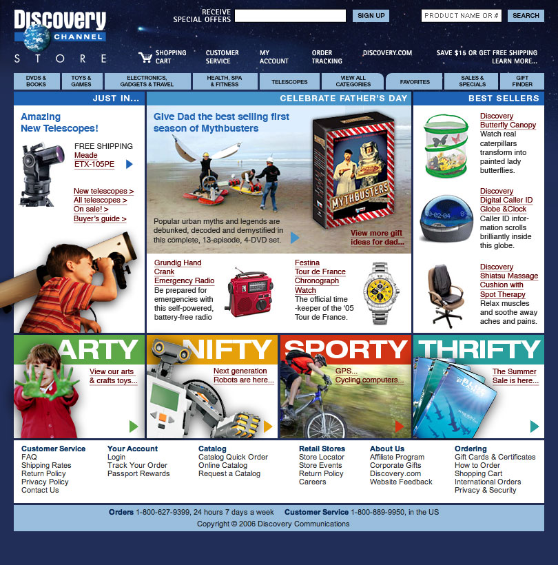
2006
Design exploring a new information hierarchy and user interface for the revamped Discovery Channel Online Store. Using color, photography, and thematic ties to organize aspects of the site and encourage user exploration.
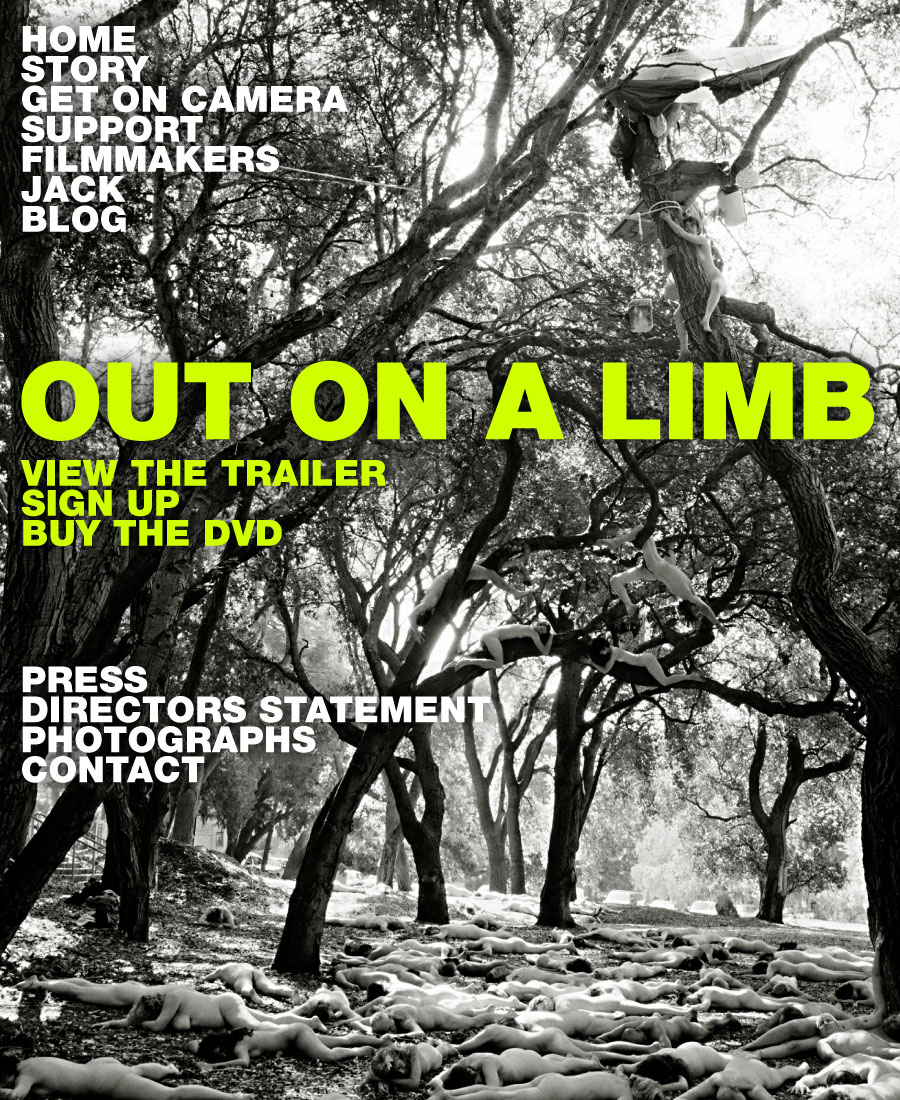
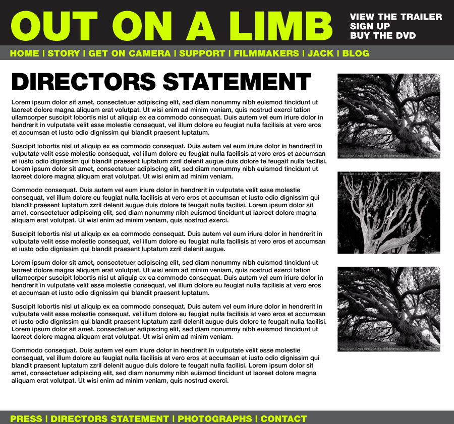
2010
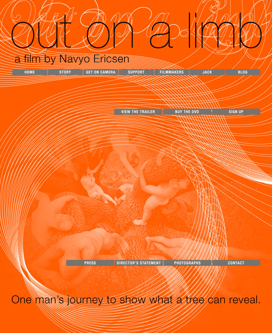
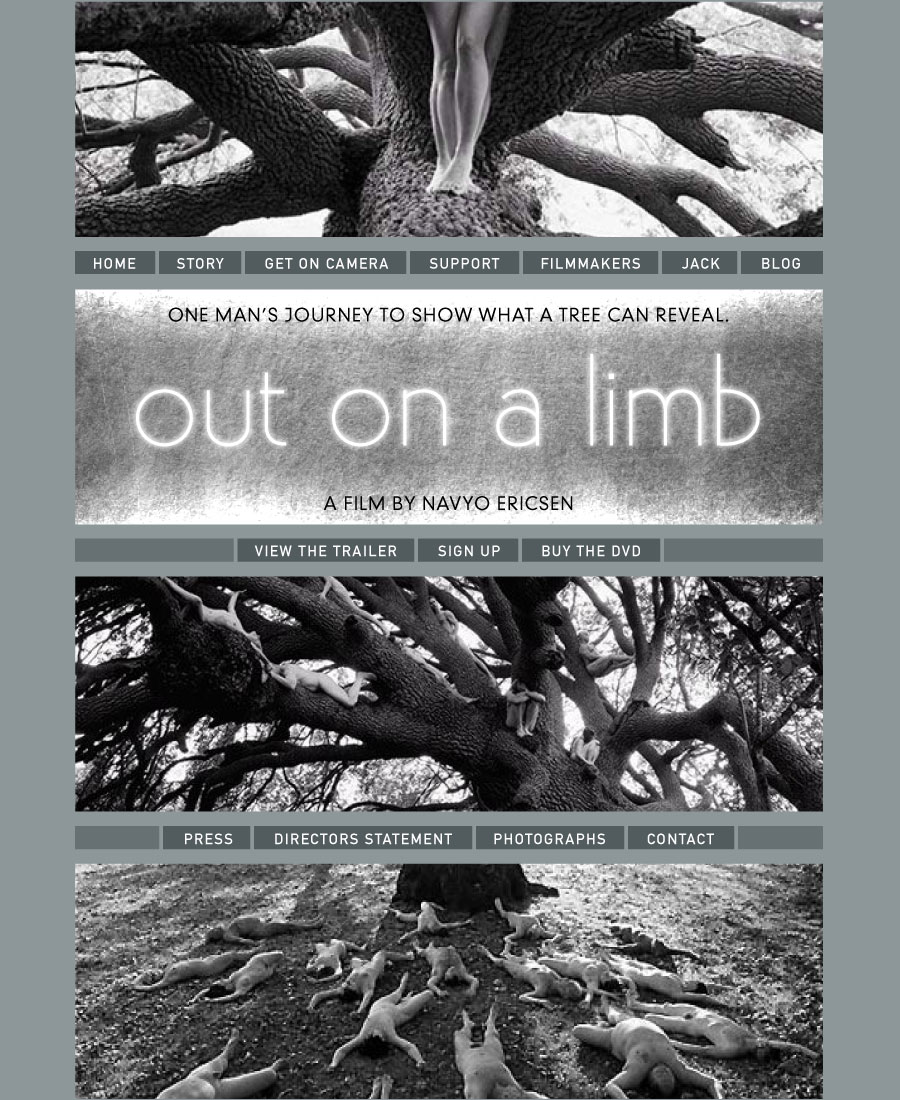
Website and identity design for this documentary film in-production, created to assist in fund-raising, event planning, and film promotion. The designs are high-impact yet still an organic showcase for the photography. All three of the design options shown here were created to be effective showcases for the photography through distinctly different moods.
2010
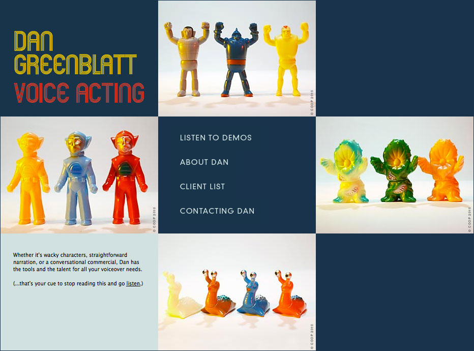
Promotional website for voice actor Dan Greenblatt, designed to convey the personality of his voices - fun, diverse and easy-going. The modular layout takes a color palette from the vinyl toy (photography by Coop).
2010
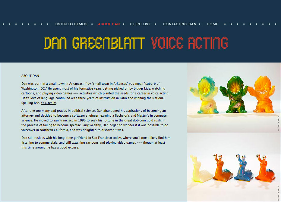
Promotional website for voice actor Dan Greenblatt, designed to convey the personality of his voices - fun, diverse and easy-going. The basic grid takes a color palette from the Coop photography used throughout.
2012
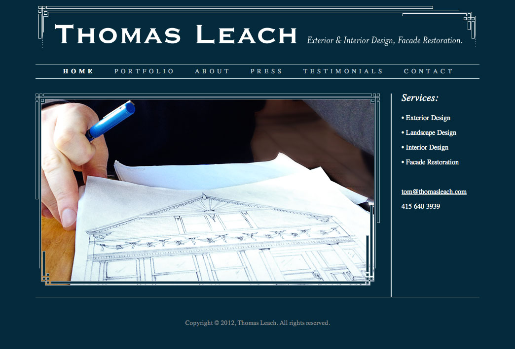
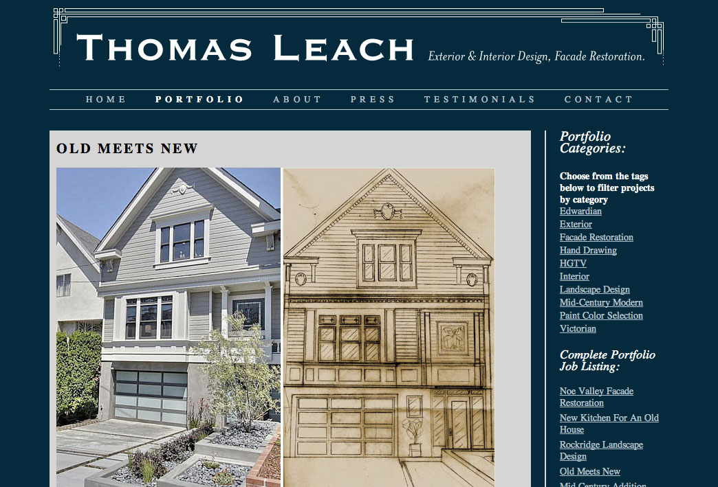
Portfolio website showcasing the work of exterior and interior designer, Thomas Leach. With sections giving information about the designer, mentions in the press, testimonials, and examples of his work restoring the facades of classic California homes and gardens. Updatable by the designer, the site was created in collaboration with the designer to echo his own vision and taste.
View the full site at thomasleach.com.
2009
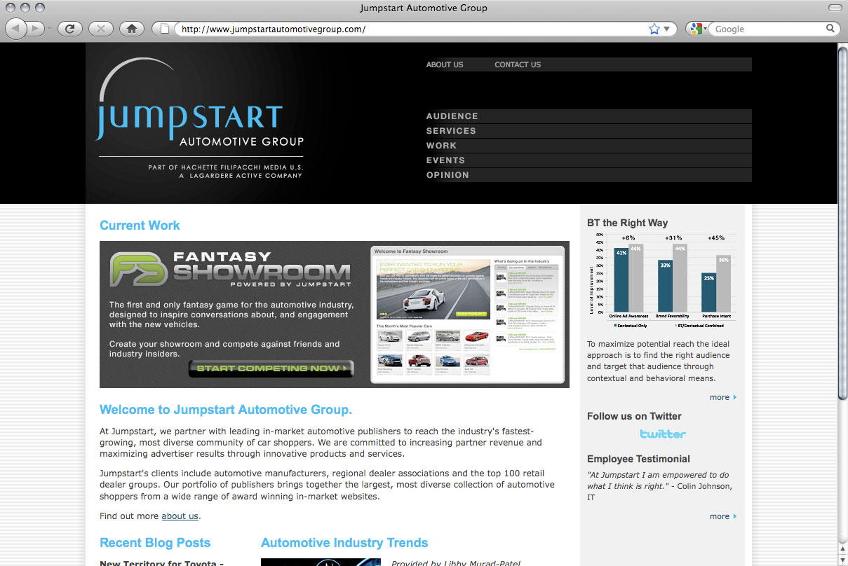
Assertive, crisp design for this online automotive advertising company. Website echoes the colors and simple forms established in the identity design for the company.
2009
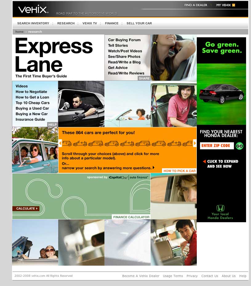
New drivers information and advice, created as a hub collecting information from a network of automotive websites. The modular design is engineered to fit on any one of the websites with a unique identity.
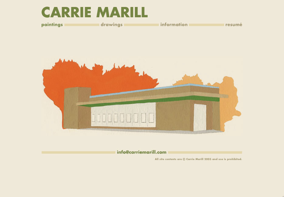
2006
Artist's portfolio website, taking color cues from Marill's work. Using a bold, simple design.
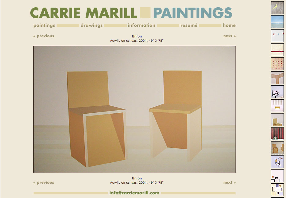
2006
Artist's portfolio website, taking color cues from Marill's work. Using a bold, simple design.
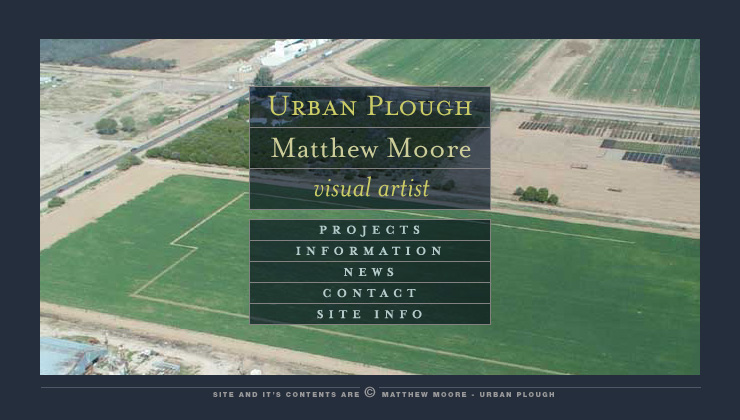
2005
Site organizing, documenting, and promoting Matthew Moore’s large scale art work. Using a subdued color palette allows the photography of these works in nature to shine while lighter act to aid navigation.
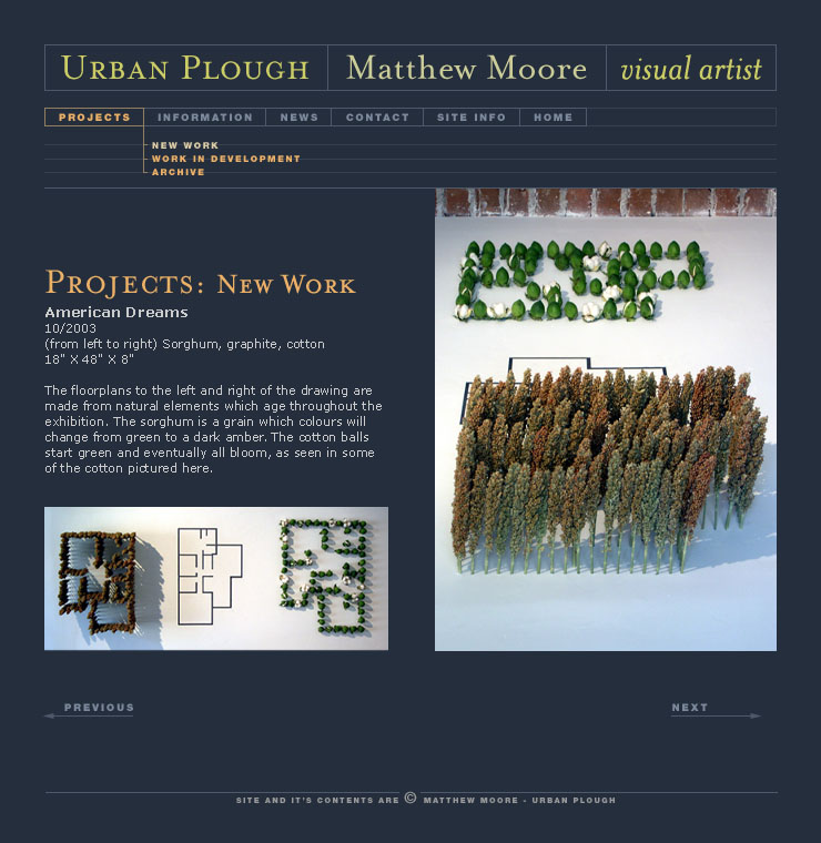
2005
Site organizing, documenting, and promoting Matthew Moore’s large scale art work. Using a subdued color palette allows the photography of these works in nature to shine while lighter act to aid navigation.

2004
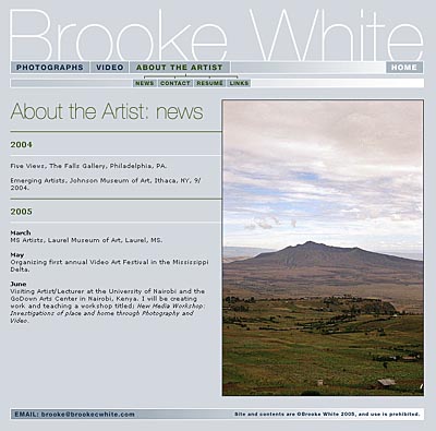
Photographer's portfolio website, taking design and color cues from White. Clean, sparse design brings the rich photography to the fore.
2004
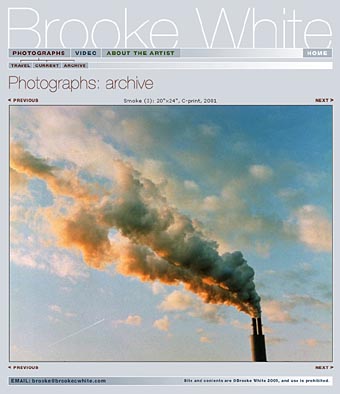
Photographer's portfolio website, taking design and color cues from White. Clean, sparse design brings the rich photography to the fore.
2004
Photographer's portfolio website, taking design and color cues from White. Clean, sparse design brings the rich photography to the fore.
2001
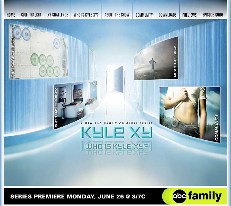
Website teasing the show Kyle XY. Design process was tricky as the show was still top secret, so the site had to be intriguing without revealing too much. Creating a fictitious space for people to enter and explore was key, drawing inspiration from modern architecture in anonymous spaces.
2001
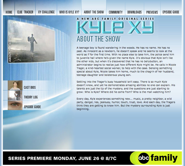
Website teasing the show Kyle XY. Once inside of the site, the curved walls slide around to reveal select pages with info about the show.
2001
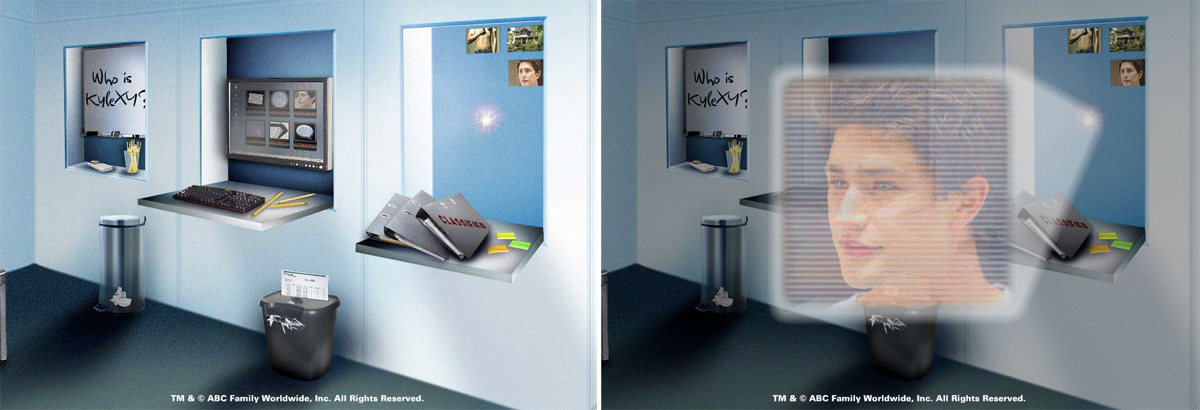
Website teasing the show Kyle XY. This section was called the "Cluetracker Room", filled with specially created clues to the identity of Kyle for people to discover by moving around the room.
2000
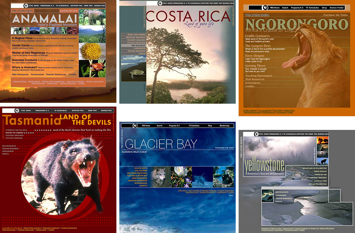
An award-winning series of websit designed and built for PBS, supporting their documentary series The Living Edens. Each website embodies the spirit of the land featured in each episode.
1998
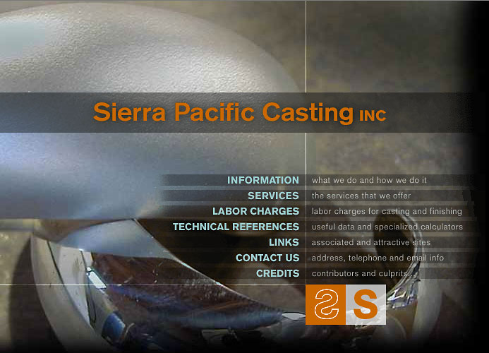
Website and photography for California casting house, Sierra Pacific Casting. Designed to showcase the professional and detailed custom services available.
2013
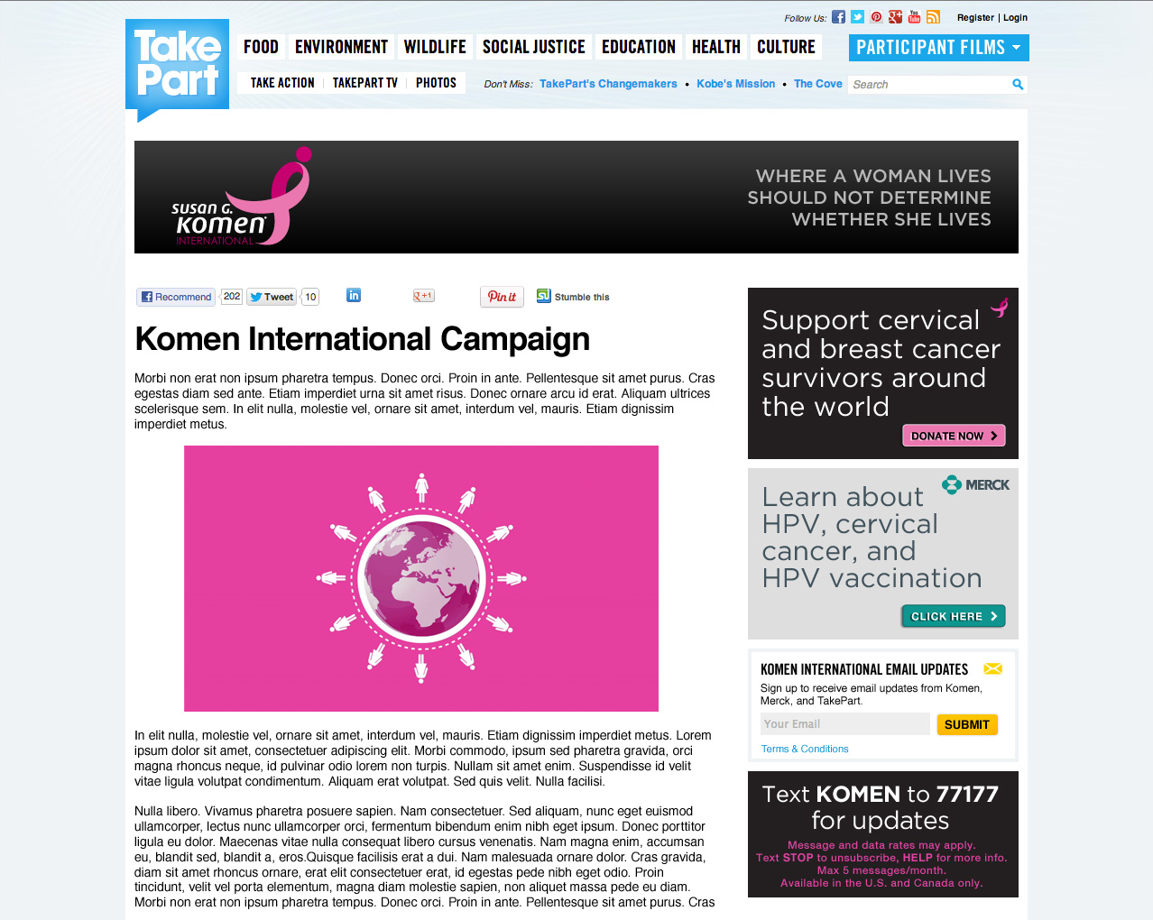
Website to promote the Susan G. Kommen International Campaign on TakePart.com.
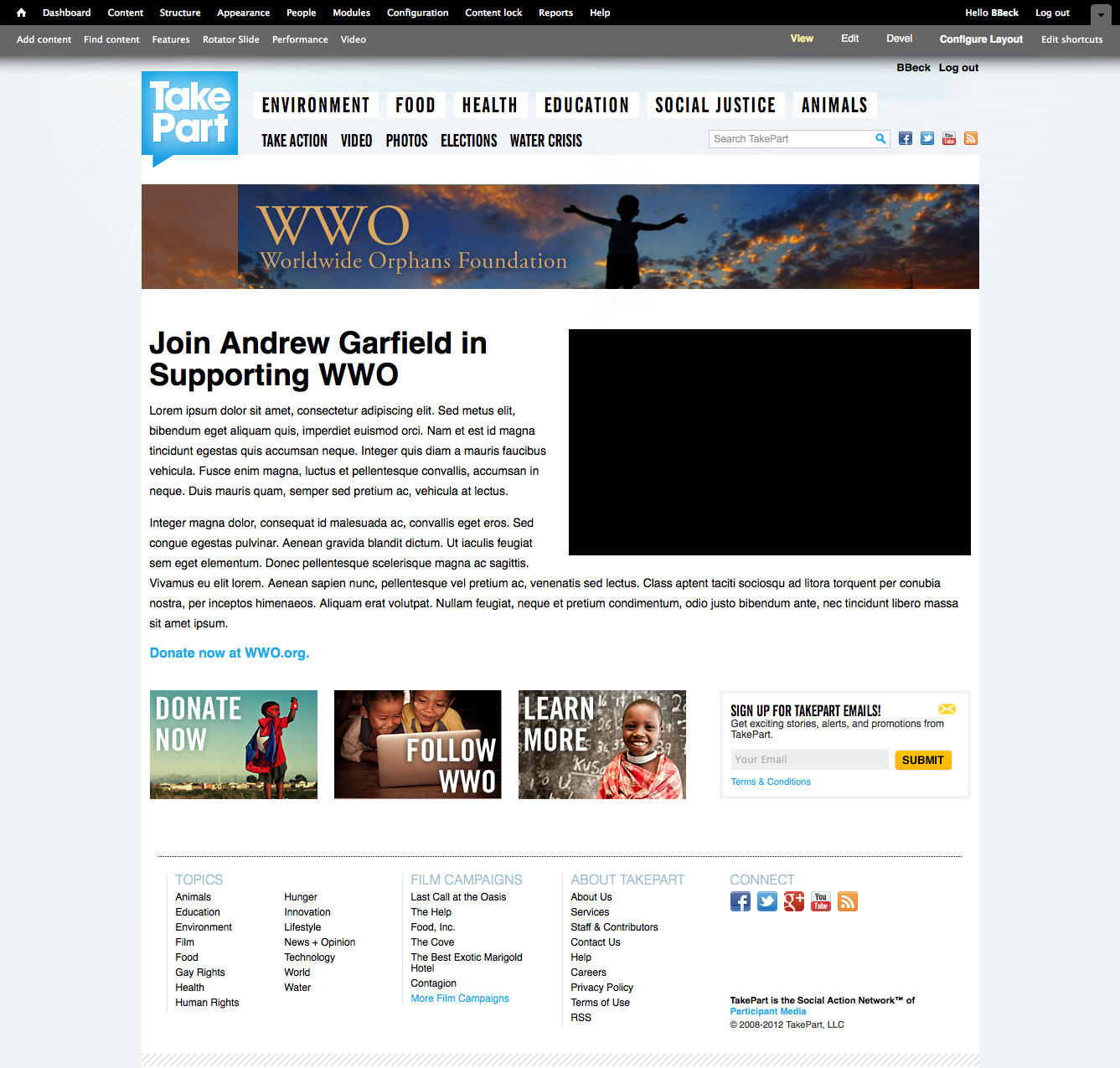
2012
A site to support the message conveyed in a video from the World Wide Orphans Foundation with Spider-Man actor, John Andrew Garfield.


2013
A mobile-friendly website to encourage people to sign the petition to conserve water and protect the diminishing Colorado River.
2010
Designs for the internal sections of Stainmaster.com. The cool elegance of the design uses the swooping shape of the underline in the logo as a page dividing graphic element, reinforcing the brand. The navigation uses custom icons and photography to ease movement within the site.
2010
Designs for the internal sections of Stainmaster.com. The cool elegance of the design uses the swooping shape of the underline in the logo as a page dividing graphic element, reinforcing the brand. The navigation uses custom icons and photography to ease movement within the site.
2007
Four design options for RomanMeal.com. Created to promote the company as a proponent of positive health and the benefits of whole grains. Site design, architecture, photography direction, food styling, and production direction were all part of the final delivery.
2007
Four design options for RomanMeal.com. Created to promote the company as a proponent of positive health and the benefits of whole grains. Site design, architecture, photography direction, food styling, and production direction were all part of the final delivery.
2007
Four design options for RomanMeal.com. Created to promote the company as a proponent of positive health and the benefits of whole grains. Site design, architecture, photography direction, food styling, and production direction were all part of the final delivery.
2007
Four design options for RomanMeal.com. Created to promote the company as a proponent of positive health and the benefits of whole grains. Site design, architecture, photography direction, food styling, and production direction were all part of the final delivery.
2014
A crisp, clean, bright logo and site design for the experienced auctioneers of Stellar Fundraising Auctions. The modular design means the content and blog is simple to edit and keep up-to-date.
2014
A bold new site, including logo revamp and custom photography for this Santa Monica based sports media specialist. Easy to update and expand.
2014
A bold new site, including logo revamp and custom photography for this Santa Monica based sports media specialist. Easy to update and expand.
2012
Website for the film "NO", about 1988 advertising campaign around the Chilean referendum on military dictator Augusto Pinochet's presidency. Site design uses classic '80's visual elements and objects derived from the film to create an engaging atmosphere for the social action elements, as well as promoting and echoing the film itself.
View the site here.
2012
Cover, gallery, ad banner designs, and photo manipulation for this TakePart.com and MSN website. Highlighting specific issues each week with a strong, clean bright design to reinforce a positive approach to these serious messages.
2012
Cover, gallery, ad banner designs, and photo manipulation for this TakePart.com and MSN website. Highlighting specific issues each week with a strong, clean bright design to reinforce a positive approach to these serious messages.
2012
Portal / hub website to promote the work of artist, Ben Templesmith. Comprising of a gallery, blog, appearances diary, contact section, and consolidating all of his social media and store links. Updatable by the artist, the site design echoes and compliments the current style and color palette established in his existing logo.
2007
Designed and architecture of proposed Dreyer’s website. Using an animated, circus-themed design, each product family has a performer representative. The site highlights the diverse variety of Dreyer’s products, incorporating social media element to encourage interaction and participation.
2007
Designed and architecture of proposed Dreyer’s website. Using an animated, circus-themed design, each product family has a performer representative. The site highlights the diverse variety of Dreyer’s products, incorporating social media element to encourage interaction and participation.
2008
One of three designs for an elegant new home page for this pharmaceutical site. Created to help individuals quickly find the right information for their specific problem by color-coding each aspect of the site, and photographically giving a human face to each section of the site.
2008
One of three designs for an elegant new home page for this pharmaceutical site. Created to help individuals quickly find the right information for their specific problem by color-coding each aspect of the site, and photographically giving a human face to each section of the site.
2008
One of three designs for an elegant new home page for this pharmaceutical site. Created to help individuals quickly find the right information for their specific problem by color-coding each aspect of the site, and photographically giving a human face to each section of the site.
2007
Modular home page designs for rich-media Verizon Surround home. Two different marketing sponsorship options are depicted within the same design, to illustrate the flexibility of the design.
2007
Modular home page designs for rich-media Verizon Surround home. Two different marketing sponsorship options are depicted within the same design, to illustrate the flexibility of the design.
2006
Home page design targeting new user sign-ups, and generally more appealing for new visitors to the site.
2006
Design exploring a new information hierarchy and user interface for the revamped Discovery Channel Online Store. Using color, photography, and thematic ties to organize aspects of the site and encourage user exploration.
2010
Website and identity design for this documentary film in-production, created to assist in fund-raising, event planning, and film promotion. The designs are high-impact yet still an organic showcase for the photography. All three of the design options shown here were created to be effective showcases for the photography through distinctly different moods.
2010
Promotional website for voice actor Dan Greenblatt, designed to convey the personality of his voices - fun, diverse and easy-going. The modular layout takes a color palette from the vinyl toy (photography by Coop).
2010
Promotional website for voice actor Dan Greenblatt, designed to convey the personality of his voices - fun, diverse and easy-going. The basic grid takes a color palette from the Coop photography used throughout.
2012
Portfolio website showcasing the work of exterior and interior designer, Thomas Leach. With sections giving information about the designer, mentions in the press, testimonials, and examples of his work restoring the facades of classic California homes and gardens. Updatable by the designer, the site was created in collaboration with the designer to echo his own vision and taste.
View the full site at thomasleach.com.
2009
Assertive, crisp design for this online automotive advertising company. Website echoes the colors and simple forms established in the identity design for the company.
2009
New drivers information and advice, created as a hub collecting information from a network of automotive websites. The modular design is engineered to fit on any one of the websites with a unique identity.
2006
Artist's portfolio website, taking color cues from Marill's work. Using a bold, simple design.
2006
Artist's portfolio website, taking color cues from Marill's work. Using a bold, simple design.
2005
Site organizing, documenting, and promoting Matthew Moore’s large scale art work. Using a subdued color palette allows the photography of these works in nature to shine while lighter act to aid navigation.
2005
Site organizing, documenting, and promoting Matthew Moore’s large scale art work. Using a subdued color palette allows the photography of these works in nature to shine while lighter act to aid navigation.
2004
Photographer's portfolio website, taking design and color cues from White. Clean, sparse design brings the rich photography to the fore.
2004
Photographer's portfolio website, taking design and color cues from White. Clean, sparse design brings the rich photography to the fore.
2004
Photographer's portfolio website, taking design and color cues from White. Clean, sparse design brings the rich photography to the fore.
2001
Website teasing the show Kyle XY. Design process was tricky as the show was still top secret, so the site had to be intriguing without revealing too much. Creating a fictitious space for people to enter and explore was key, drawing inspiration from modern architecture in anonymous spaces.
2001
Website teasing the show Kyle XY. Once inside of the site, the curved walls slide around to reveal select pages with info about the show.
2001
Website teasing the show Kyle XY. This section was called the "Cluetracker Room", filled with specially created clues to the identity of Kyle for people to discover by moving around the room.
2000
An award-winning series of websit designed and built for PBS, supporting their documentary series The Living Edens. Each website embodies the spirit of the land featured in each episode.
1998
Website and photography for California casting house, Sierra Pacific Casting. Designed to showcase the professional and detailed custom services available.
2013
Website to promote the Susan G. Kommen International Campaign on TakePart.com.
2012
A site to support the message conveyed in a video from the World Wide Orphans Foundation with Spider-Man actor, John Andrew Garfield.
