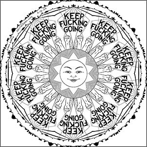
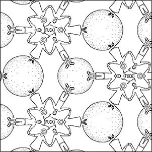
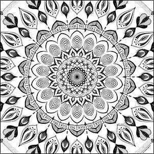
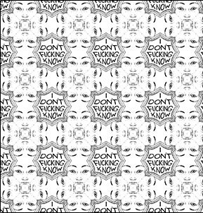
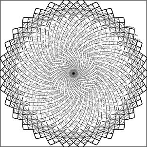
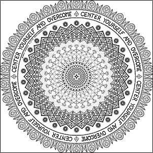
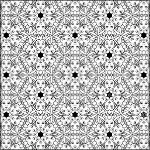
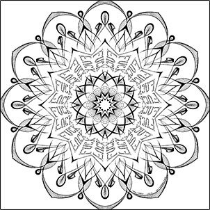
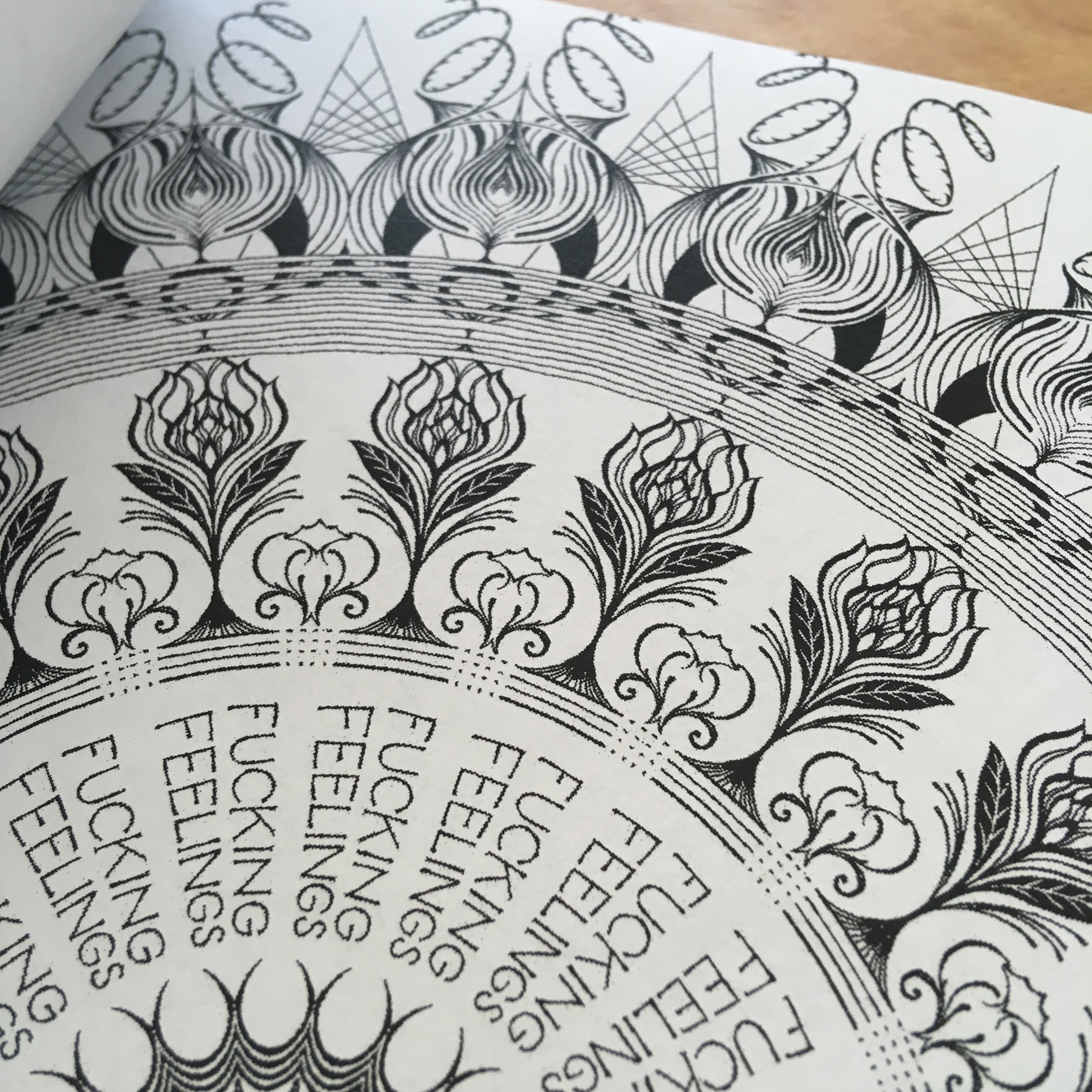
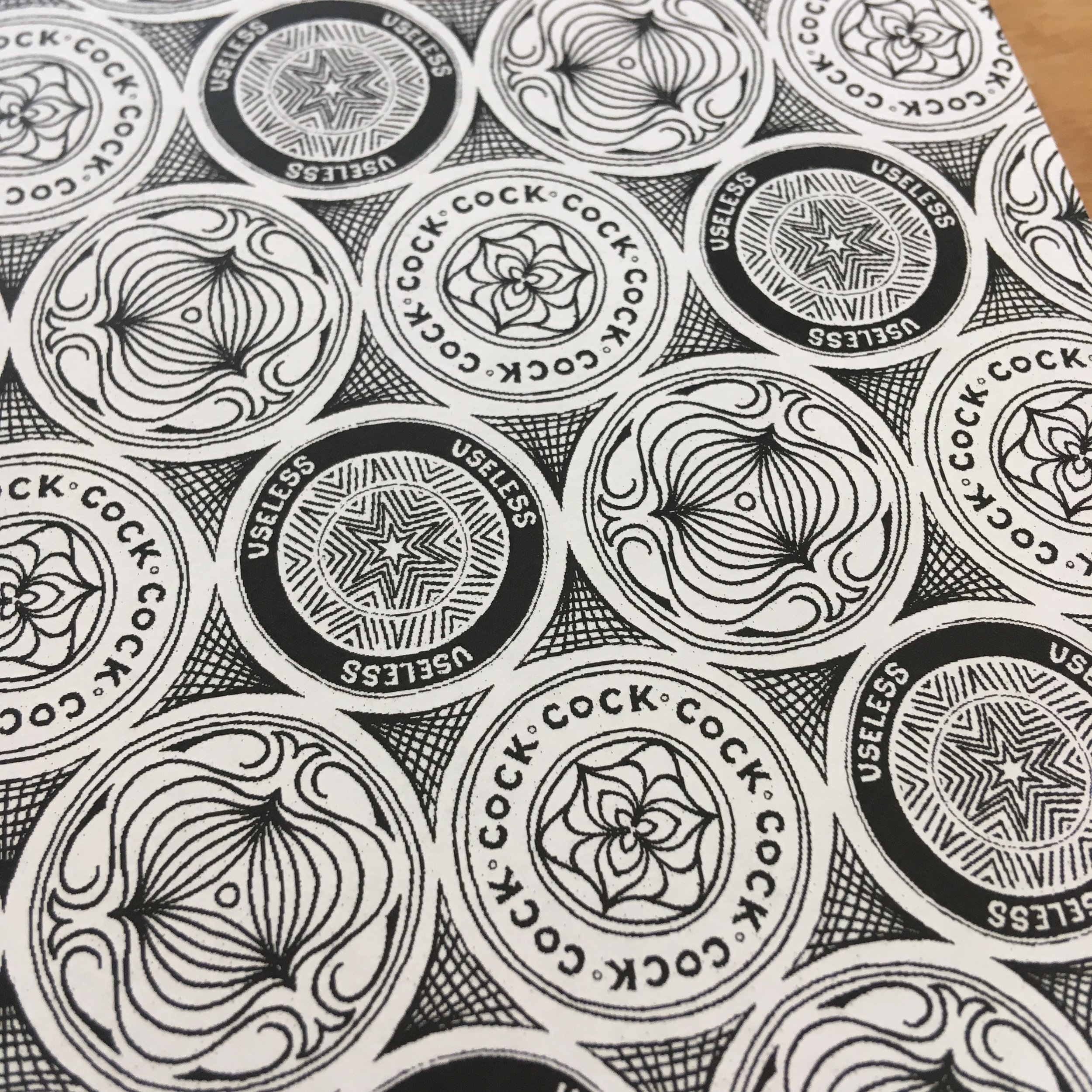
Nine of my most relevant swearing patterns (and even a couple of non-swearing patterns) are up as digital coloring pages for you to download and color on your tablet or computer. Click on the thumbnails below to open the full-size jpgs, save those to your device and color them in with your chosen app. Alternatively here is a pdf of all of them. (When you're done, if you post your images then tag them with #SwearingPattern, I'll repost them to the Swearing Pattern instagram.)
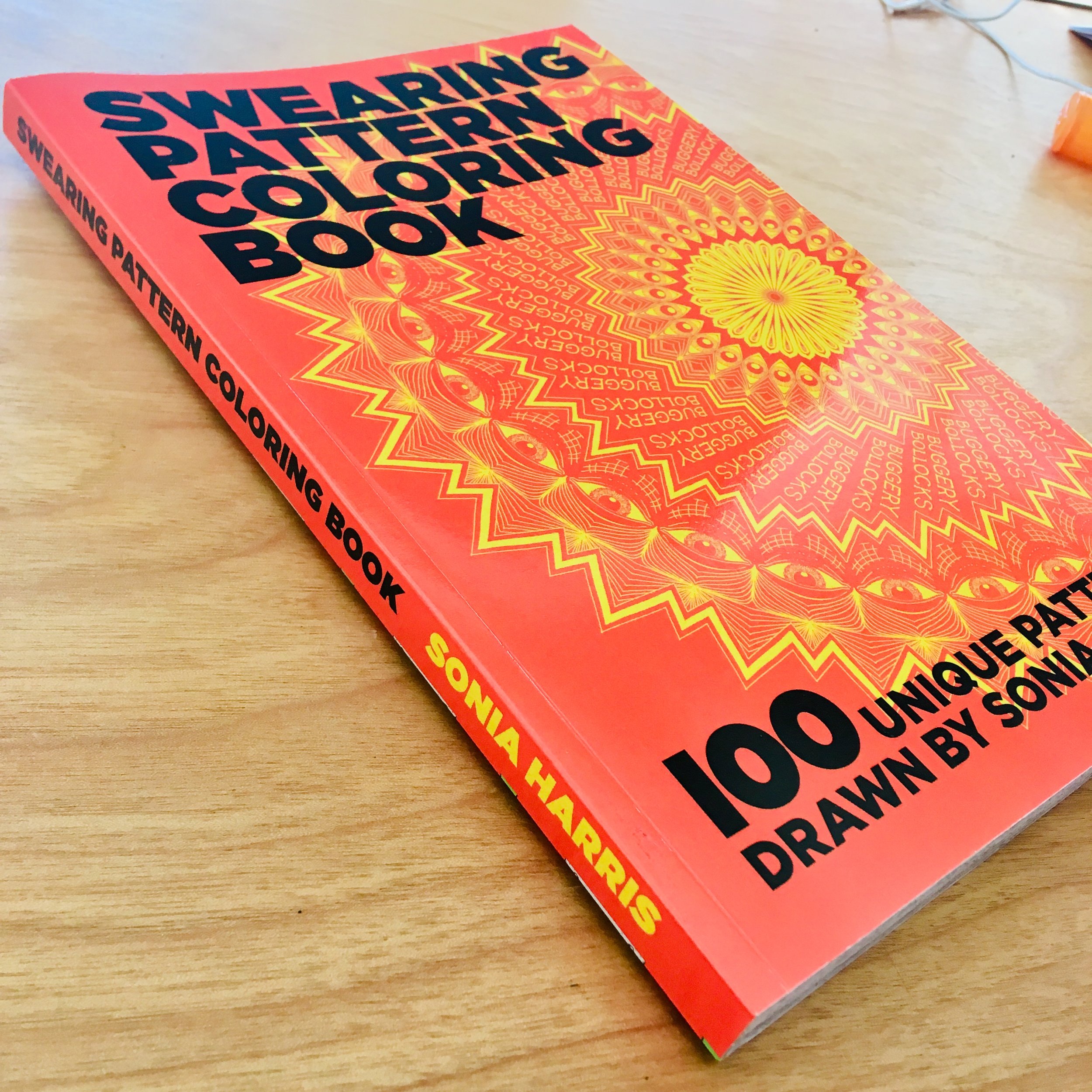
I made a Swearing Pattern coloring book!
Over the last couple of years I’ve been drawing a lot of swearing patterns. These are patterns I draw, either repeating or mandalas that incorporate swearing in them. I find it incredibly cathartic and helpful to draw these patterns, and even more so to look at them closely and color them in! Buy it on Amazon and get 100 of my patterns, (that’s half an inch swearing!) and soon I’ll post a limited quantity on the shop I’m setting up here (coming soon!) for all the people who about signed copies.
AGAIN?!
Remember how 2015 and 2016 got eaten up by disease? 2017 brought an even worse one! I wrote about it here, and about what kind of work it inspired. TLDR: It turned out that I had stage 3 breast cancer and treating cancer is just as bad as you think it is (worse). Life is a hell of a trip and I'm enjoying the ride even if it is bumpy as hell. The whole thing gave me a chance to get back to my roots, drawing patterns about how pissed off I am. That's where the new Patterns section on this site comes from (samples of my drawings) and the very entertaining swearing patterns website I set up at secretbean.etsy.com. It is filled with T-shirts, leggings, coffee mugs, pillows, etc, all adorned with my insane swearing patterns. It makes me very happy.
I wonder what 2018 will be like...?
Officer Downe Photography and Design Elements
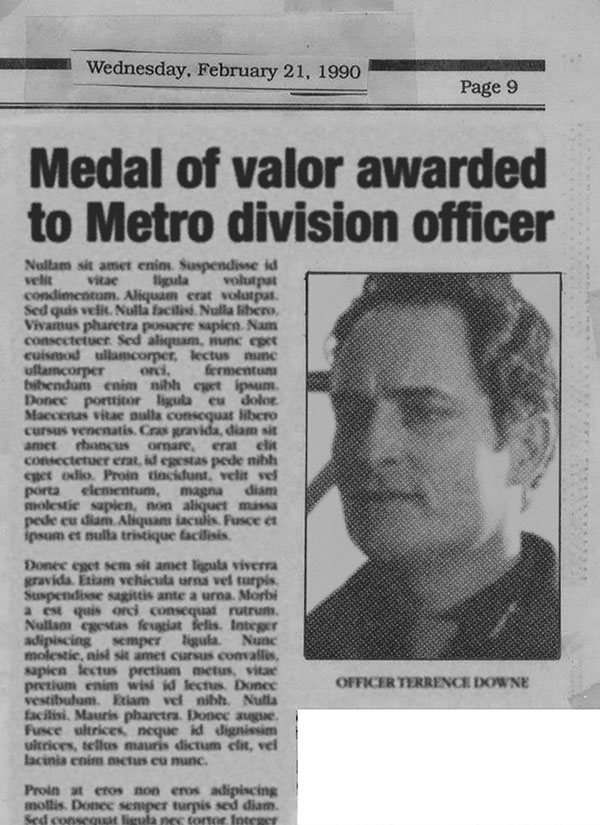
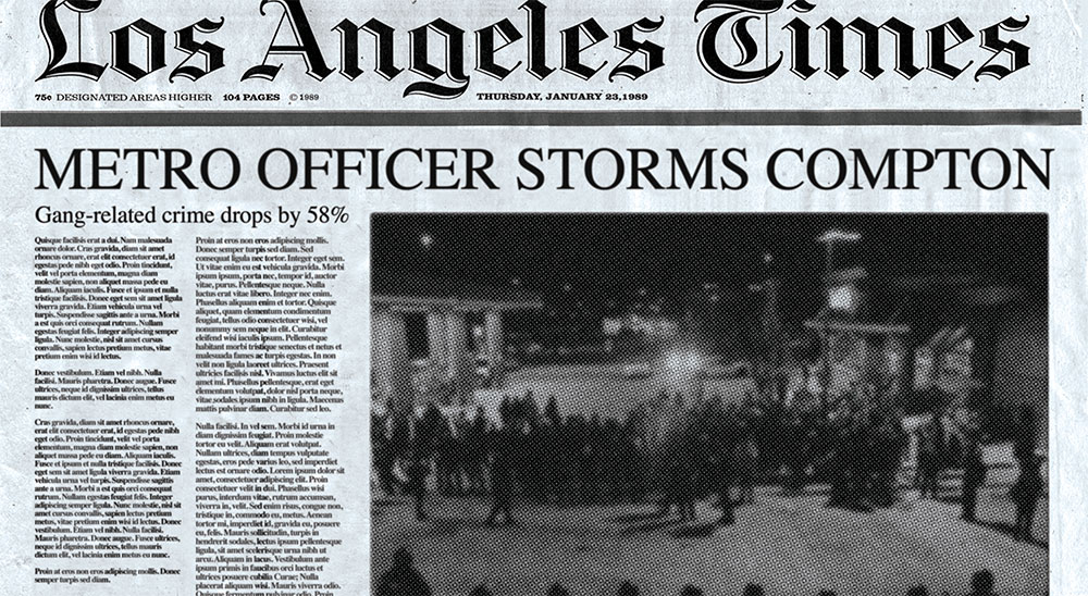
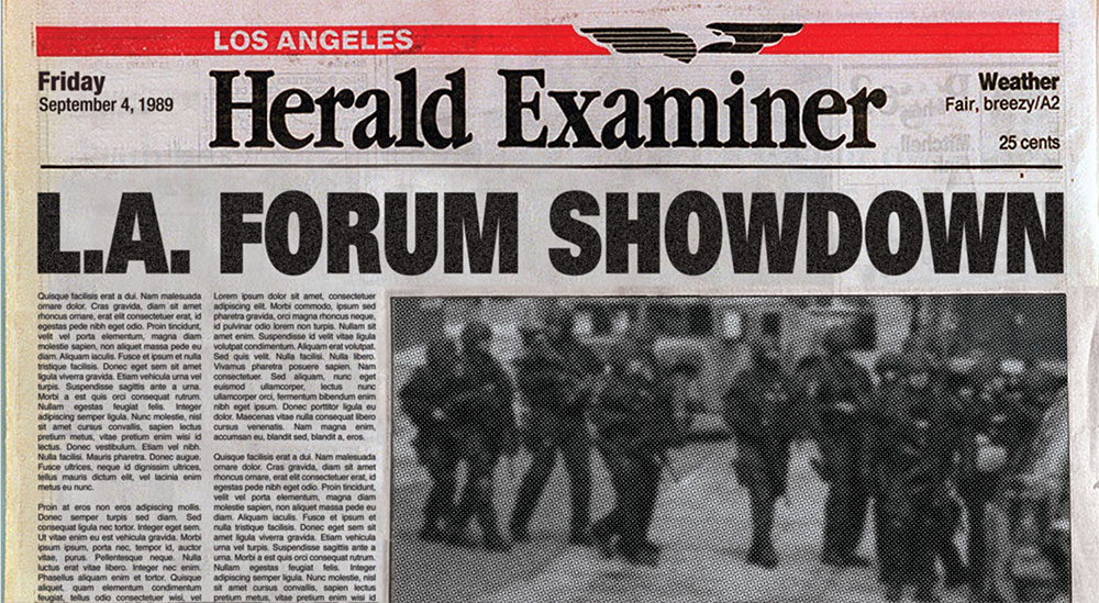
While working on select graphic design projects for the recently released Officer Downe movie I was asked to create some fake background documents to show the history of the character. These only show up in quick fleeting shots, but here are some of the articles and ephemera which I designed.
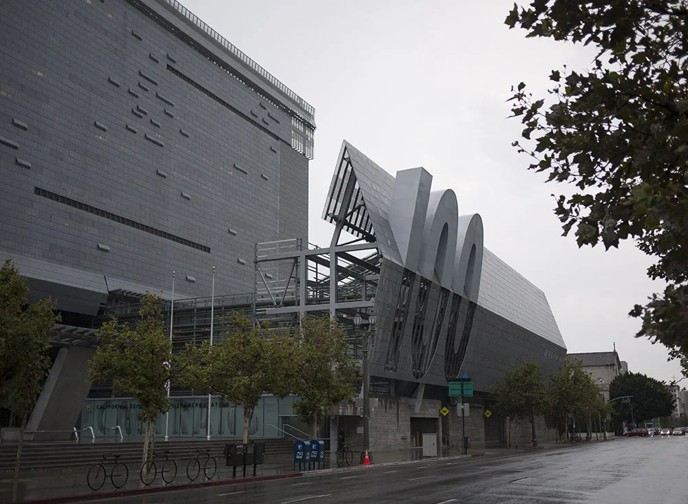
My locations photography was used as establishing shots throughout the film, in collages and flashes which allowed for movement without the need to film the locations.
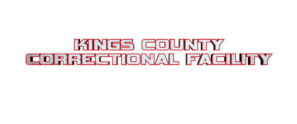
And finally, I designed a few title graphics to announce various events. The brief on these was to be as obnoxious as possible, not to use any design rules or establish one cohesive look, (I'm paraphrasing, but that was the gist of it) to fit within the crazy chaotic mood of the finished film.
Pretty soon I'll post some screenshots of these items in-situ so that you can see them within the context of the finished movie. Until then, enjoy these raw materials and check out the movie yourself!
Officer Downe Premiere on the Red Carpet, Behind-the-Scenes Photos
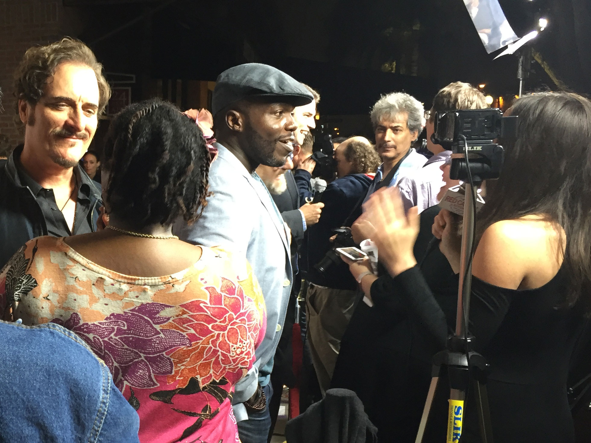
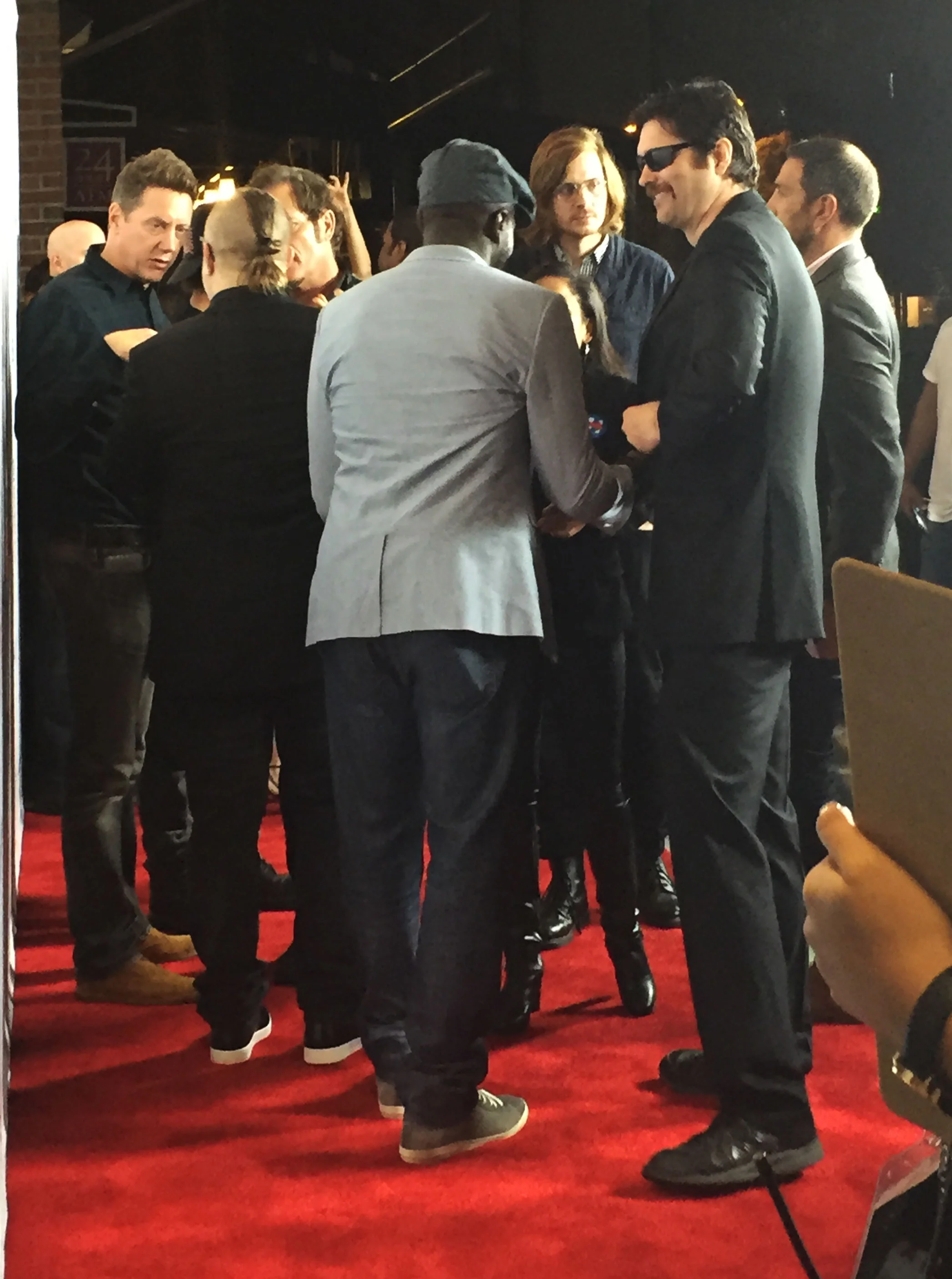
At the premiere of Officer Downe on Friday I took a few photos. (If you click on the thumbnails you can see larger versions, and if you roll over those you'll see titles.)
What happened?
Last year sort of disappeared down a disease-shaped hole for me. It isn't design-related so I didn't post it here, but you can read about it on Medium if you'd like. Now that I am recovering, and gradually able to return to work I am suddenly aware of how much strength and stamina it takes to fully engage with creative work. So take care of your bodies, we're fragile machines and we need all of our energy to keep making the beautiful things!
Review: Valhalla Mad #1
My design work (on upcoming and existing books by author, Joe Casey) was favorably mentioned in this review of Valhalla Mad:
"Casey’s titles tend to have exceptional production design, and the cover for Valhalla Mad, intended to look like the weathered binding of an ancient text, is sure to make it stand out on comic store shelves."
I'm very excited to be working on this series and designing each cover to echo a different era of the decorative arts. Working with talented artist, Paul Maybury is another bonus, as his beautifully painted art completes every cover design.
Bob & Carol & Ted & Alice
Sometimes you find an original poster for a film which speaks volumes about the era in which it was made. This is one of those. Using the simple and unusual (at the time) device of a pattern made simply from the long title of the film is eye-catching. Using Cooper Black to do so is quintessentially of that era, so fashionable in 1969, but so completely out of fashion now. Despite the apparent modernity of a poster featuring a single sentence in a single typeface, this is far from minimal, and instead speaks to the brutally decorative designs styles typical of that time. I love it.
Allen Jones' Influence
Above is Allen Jones' masterful abstraction of legs, shoes, and above all, the overt approach to sexuality at the time... Relevant to our culture now, the painted nature of the image betrays it's artificiality and the false nature of the male gaze.
For 3 years I've been trying to remember his name, I wanted to cite the influence his work had on my approach to the mood of the covers of the SEX collections, specifically volume 2 (pictured right.) Clearly the end-result of my work is quite different, changing the posture, line quality, color palette, etc to come to a new conclusion. When I was working on it, I kept describing Jones' work to my collaborators but they didn't knew what I was talking about. Finally a friend mentioned Jones in passing and now I finally have some context to place this cover in.
Details are IMPORTANT
It's a shame that people post these inspirational quotes with such a glaring error, so instead of inspiring me they just irritate me! Lately I've taken to photographing signage and logos which use inch and feet marks instead of apostrophes and quotation marks. Businesses and stores invest money in creating graphics, erroneously trusting their designers to do a professional job but in these cases they're sadly let down. Here are a few recent offenders.

